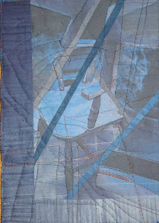
In previous posts I outlined my ideas for February's TIF challenge based on the idea of combining the adult and childs's view of an antique chair I used to use as a den -' When I was small enough'. I'd taken photos and played around in 'Photoshop', settling in the end for working with the 'neon glow' effect as that also matched some of the colours in the challenge palette.
The problems started mounting when I attempted to translate it into fabric - to the point I think I can now construct a whole list of 'how- NOT- to- do- it' hints. It started innocently enough with printing off 1 image ( adult view) on cotton poplin and 2nd ( child's) on silk organza to replicate the image above. Only the organza only takes up a certain amount of ink and the image was a blur with no shape to it ( interesting effect tho' like hand dyeing - I'm sure I can use it for something else )
Lesson 1. Results achieved in Photoshop are not necessarily directly transferable to fabric
Lesson 2. Just because it's worked before dozens of times before doesn't mean it will work this time!
Then I thought I'd try combining the images physically so printed out the childs view on cotton poplin too. I played around with the images printed on paper first , cutting up and recombining ( something I've done very effectively before). I liked the effect but the problem with doing it in fabric is the seam allowances and shrinkage . So I added in strips of indigo fabric between but started losing the clarity of the image I wanted to achieve . I couldn't decide which combination I liked most so continued with both.
Lesson 3. Applying excercises in paper to fabric are not straight forward - think seam allowance
Lesson 4. Don't dilute effort - choose strongest image and go with it
TIF Feb 'When' Side 2
The problems didn't stop there - no I dug myself in deeper!
Despite adding in extra strips ( which didn't work anyway) once straightened up, the pieces were way smaller than the A4 size I wanted to achieve for my Journal Quilt. So I added on a border to bootom and side - only it is obviously an add-on and not part of the design.
Lesson 5. Design is all - don't add on superfluous parts to achieve the 'correct' size.
Lesson 6. Sometimes a piece has its natural size and shouldn't be forced
As I had 2 sides, I decide to make a double-sided piecec as I had done for January TIF , outlining shapes with quilting first from one side , then the other. Only a cut up image does not give strong lines and structure to quilt round. Result = mess. Which is worse, side 1 or 2????
As I had 2 sides, I decide to make a double-sided piecec as I had done for January TIF , outlining shapes with quilting first from one side , then the other. Only a cut up image does not give strong lines and structure to quilt round. Result = mess. Which is worse, side 1 or 2????
Lesson 7. Repeat lesson 2 ( just because it's worked before....)
Although I'm frustrated that my ideas didn't work out in practice, I've certainly learnt a lot from this challenge so I guess it's been successful even if the final result wasn't !!The main take home message for me is:
Lesson 8. Less is more - don't fit too many ideas into one piece.
I thought I'd learnt this lesson a long time ago but it seems a reminder is due!
Thanks for all the sympathy for my dental problems - I'm now on my second course of antibiotics after a visit to the doctor ( with swollen glands and still feeling grotty). Apparently I should have had 2 different ones initially to deal with both aerobic and anaerobic bacteria so job only half done.


