A much more productive time in week 9 of Contemporary Painting Studio thanks to thinking about what I wanted to concentrate on in the last couple of sessions and some prep work during the week. I was particularly pleased with the 2 Journal Quilts I produced (above)
My prep work included taking a high res photo of the finished A3 painting that I was reasonably happy with and printing it out on my A4 inkjet printer using 'poster' settings at 3x3 and 2x2 sizes in order to have the scaled up marks to work from
The 3 x 3 pinned up on the screen was very helpful for working on my large scale newspaper collage . I used burnt umber /ultramarine glazes to make greys , it's still a bit heavy - one of the problems with working on a textured surface and I need to pay attention to the edges of shapes.
The section of old quilt I'd primed with gesso was even more textured so I worked with it, simplifying the shapes from the 2 x2 print. Again a limited palette of Paynes grey, raw sienna , burnt umber and ultramarine with some white reintroduced in areas.
The first item on my 'to-do' list was to prime the quilted collages I'd prepared during the week with diluted acrylic medium so that my paint glazes wouldn't bleed/sink into the fabric.
I'd printed out photos of 2 collages onto Jacquard Inkjet Cotton sheets ( 2 x 1 poster setting stitched together) attached to linen tablecloth with bondaweb then quilted with horizontal wavy lines.
It took a couple of hours to dry ( I'd do it before class another time!)
For painting I used Winsor and Newton transparent acrylic paints in Raw Sienna, Burnt Umber and Ultramarine mixed with gloss medium/Golden soft gel and diluted with water and applied with dry brush . I loved how the brushmarks were retained.
I had a question from one of the other artists in the class who paints with oils why I was using my own W& N acrylic paints rather than the acrylics supplied . Apart from being better quality , highly pigmented and truly transparent ( which is the effect I wanted to achieve) , the main reason is having a lot of experience painting with W&N watercolours, I'm used to the colours and colour mixing . Every paint brand has it's own characteristics - I also use Liquitex heavy body for impasto and Golden fluid for textiles.
Jasper John Catenary (Jacob's Ladder)
Earlier in the week I'd finally made it to the Jasper Johns exhibition at the RA. I was pleased to see more of his joint project with Samuel Beckett which had been one of the highlights of the print exhibition at the British Museum and like Olga, appreciated his more recent, personal work over the targets and numbers ( while noting the use of collage....)
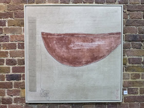
I was particularly struck by the particular curves of his 'Catenary' series and started seeing them everywhere and realising that a lot of work I admire contains similar shapes.
Susie Koren View Seven
I realised that there's a similar curve in this painting and that one of the reasons the largest collaged painting isn't working yet is because the curve is wrong. So I knew what I had to do in my final painting session .


Love the synchronicity of you seeing Jasper John's Catenary at the same time as reviewing your own work. Like you, I found that it had a familiar ring to it.
ReplyDeleteCan't wait to see the revised curve!
I've been fascinated to read of your progress at the paint studio. Your image has been ringing a faint bell at the back of my memory, and then suddenly I had it. It was Joan Eardley's Sea and Snow which your paintings brought to mind.
ReplyDeleteIt's on the ArtUk site: https://artuk.org/discover/artworks/sea-and-snow-8922/view_as/grid/search/keyword:joan-eardley-sea-and-sky/page/1
Not the same at all, but you know how these leaps happen. I look forward to seeing where your ideas go from here.
Love those two journal quilts. Must admit the painting has been bugging me, that I didn't understand that curve thing and didn't think it did anything for the piece. So I found it so interesting when you shared the bit about Jasper Johns' curves, (I found them quite compelling in all his pieces), ending with that now you could see what was wrong in your own piece and that it was fixing that curve. Isn't it exciting when you can make such connections, find answers to your own design problems through studying other artists? I'm looking forward to how you resolve your piece.
ReplyDeleteOlga, have just gone to look at Sea and Snow and I can see the connection too. Cool!
ReplyDelete