Sunday, 24 July 2016

Nautical Festival in Faversham

 Continuing the boat theme of recent posts, it was lovely to see the Thames barges and other boats  down by Faversham Creek yesterday , part of the annual Nautical Festival. We visited it last year while we were house-hunting - the 31st will be the anniversary of having our offer accepted for  our house.


 Elsewhere in town there were at least 6 Morris 'sides' performing  organised by the 'Maenads' (Wild women of Kent) shown below. A taste of what's  in store  for the Hop Festival in September.

 And as for once I had my camera with me when shopping, some photos of the gate  leading to St Mary's Church ( the brick building is  an ex-brewery, now Tesco's)


Monday, 18 July 2016

Reading a Paint Surface: Photoshop and Moving into Fabric

  Life has been on hold the last couple of weeks  looking after Ian who had surgery  on 5th July.  He's making progress   but I'm sleeping on the fold up bed which isn't very comfortable and  what sleep I get is punctuated by checking up on him a couple of times during the night.  I have a lot of admiration for full time carers -  hopefully we've only got another week of this .  There's not much time  or energy spare for creativity but I've been  playing around in Photoshop  using photos of my final 2 pieces: adjusting  hue, saturation  and using 'invert' function. I first  used this for the exercises during Elizabeth Barton's Abstract art for quiltmakers as  it inverts tones as well as colour  giving unexpected results. 

 These 2 pictures, above and below, were the originals, ( cropped to portrait format), the remainder inversion , some of them after changes to hue.


Then these 2  below are changes in hue and saturation of my favourite part of the painting where the layers of paint and brushstrokes are evident.


I've printed most of these out on Jacquard inkjet cotton sheets ( having restocked my supplies with  2 packs of 30 , that should keep me going for a while....)  These are currently marinading on my design wall while I decide how to use them as Journal Quilts .
Also in the post besides  inkjet supplies was a copy of  Jane Dunnewold's  'Creative Strength Training' which I  pre-ordered. I've started reading it  and thinking about the exercises but first I want to crystallise my understanding of  the 'Reading a Paint Surface' course now I've had time to ponder what the take -home messages are for me. By coincidence, this week's  Painters Key's  post 'returning to a cold easel' offers a  different perspective  on the same subject.
“The painting is finished when the idea has disappeared.” (Georges Braque)


Friday, 1 July 2016

Reading a Paint Surface week 5: Additions and Reverse Gear

 Final week of 'Reading a Paint Surface' at City  Lit   was about  thinking and working strategically - looking at areas  in our  paintings  where there was a deficiency; referring again to our source material  and working out the evolution of how to get there, laying something down speculatively then  working up the layers with thicker paint ( or using the 'reverse gear ' and wiping it off).Also to vary the marks and textures across the surface through  changes to velocity, thickness of paint, layers of colour.  We  started with peer feedback  of our work -  1 person thinking the areas  to keep and those to change the complete opposite of my own opinions, someone else being rather more on my wavelength. Both valuable as it makes you articulate  why you like a particular part .
 ' Green Libra' needed the  most work  doing to it , I'd scribbled over some photos  while on the train, deciding it needed  most on upper right : a bigger overlap of shapes ; more definition of the  lines particularly the negative shapes.  The tutors suggestion was to use a palette knife with orange to bring definition to that area
  I did that  and added some dark areas  and white  with the palette knife ( it certainly made it 'pop'!) However it was too heavy handed , time to apply that 'reverse gear' and remove the paint - much better.
 The final version works when desaturated too which is a relief !


Meanwhile ' Red Libra' was almost there just needed something to knock back the areas which weren't of interest ( top and right) which distracted from the main parts. This is where working on 2 painting at once came in, using ideas from one painting in the other . In this case I borrowed the green underpainting colour and applied a glaze over these areas including some nice drippy bits ( see picture at top for detail)


My 2 paintings side by side -  by no means finished  but I had an absolute ball  working on them, Although I've enjoyed the drawing and print courses, colour and paint was always my first love.
I'm now looking at painting courses for the Autumn term

Wednesday, 29 June 2016

Inspiration from Faversham Open Gardens


A very enjoyable and interesting Sunday afternoon  in search of  inspiration   at Faversham Open Gardens. Lots of plants for sale in the market and  discovery of new places and routes through the town - had no idea about this original Georgian shop fron behind the Fleur de Lis Museum.


 Among my favourite plantings : a  narrow courtyard  garden; a wild flower meadow ( yes really!) and a tall ,well-stuffed herbaceous border of architectural plants


  Unusual planting ideas: a pallet 'dresser', a school desk  and succulents hung on the wall

 Pots and containers ( sometimes of quite large specimen  plants)

 Raised planters ( lots of veggie ones made of sleepers but these were more  stylish, particularly liked the ones at Ethelbert Primary School  and  the  children were very proud and enthusiastic about their crops!)

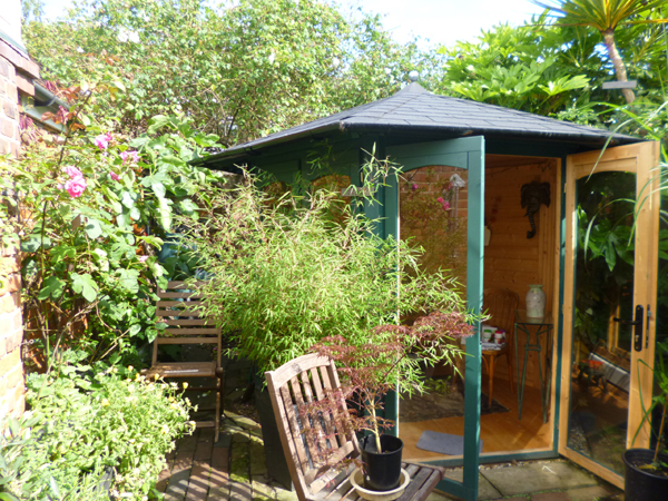
 Sheds/ Summerhouses  in small spaces gave us food for thought  when  we got home, looking at our space afresh.
 A few weeks ago while attempting to put a rotary dryer spike in the lawn , we discovered that it would only go in an inch!  Our garden basically  consists of  decking  and a thin skin of turf over rubble, no soil, so  we're having to rethink our ideas. As we'll have to import lots of soil ,hard landscaping with lots of pots and raised planters ( and possibly a  studio shed) seems the way to go. I'm  planning to do a short garden design course at City Lit in the Autumn.

Friday, 24 June 2016

Reading a Paint Surface 4: Working on 2 pieces at once.

   My favourite section so far on the current  piece of work on 'Reading a Paint Surface' at City Lit.  I have strict instructions no matter what else I  alter to leave this alone. The earlier exercises paid off - the layers and textures that have accumulated are so subtle yet interesting  and I love the hints of unexpected colours at the edges . Coloured grounds rock!!

 Arrived at the classroom yesterday to find easels with enormous boards (A0)  set up, larger than I could lift ( love the accidental marks) . The idea was to have 2 paintings going at the same time, side by side , using different methods on each. Some people started 2 new paintings  and a few besides me were continuing with  one  we'd started last week

 Having worked  from a photo upside down last time, I now was working on it sideways  so it would fit on the board, then put a drippy green cast  acrylic ground on a second piece of  A1 paper  and for my subject was  zooming in on the middle section.
Once dried I added some areas of orange underpainting that had caught my attention in the photo


Over the  day , I built up layers of oil paint glazes - I particularly like the section below. It will need a lot of work next week concentrating on the negative shapes between the boats. I might work on it upside down as well - it's getting a bit 'boaty' rather than concentrating on the shapes.  It's working title is 'Green Libra' ( the name of the boat)  and  Tony's  suggestion last thing was to put on a layer the same colour as the brushed over lettering  and work  into that next week. 


Meanwhile  my first job on 'Red Libra'  was to knock back the background with some paler glazes - once dried the orange-red ground  was too prominent .  In various critiques everyone loves the middle section and the implied shapes of the tops of the boats  so that is being left  but the dark areas top right are too dominant.
Another critique, pairing up with another student , this area is still not working so suggestion was to return to source photos - the boat wasn't in the  right position.
Much better now I've  corrected it  and I'm liking the remainder of the shape that was left  from before - this is where the responding to the painting itself is beginning to kick in.
One other criticism was the need to vary the brush marks in different areas of the paintings. This week   I was really struggling with the brushes provided - next time I'll be bringing my  own in!
We had an inspector observing the class  - it was a bit disconcerting as she listened into our conversations  ( she  didn't know anything about painting). She did like my colours though, especially the purple.
Very tired  when I got  home  as besides standing at the easel most of the day, trains were delayed  because of flooding trains and they stopped people getting on the platform as they were getting overcrowded .  There was then  a last minute dash for the train and  I had to stand until Rochester.  Getting off at Faversham found Ian had been in the same carriage!! ( I did ring his mobile but he  hardly ever has it on).