Friday, 22 December 2017

A Year of Journal Quilts


I've been making Journal Quilts since 2003 and with QGBI  Contemporary Quilt  since 2007. For this year's  CQ challenge I set the theme 'Traces, Places'  but it's turned out  most of them have been based on breakwaters(!) starting with January's trial for 'Birchington Breakwaters' . I've still got  some  partially  made so I might replace the couple that  don't fit in with the rest.

Looking forward to next years JQ challenge which is 7 x 9 inches  - my theme will be collage    

CQ Journal Quilts 2017 September to December


I feel like I've finished my year of Journal Quilts on the theme of 'Traces, Places' on a high. This set from September to December,loosely based on breakwaters, are derived from collages and paintings  made on 10 week Contemporary Painting Studio class  at City Lit.  Considering how much I love colour, I've really enjoyed and benefited from using a limited palette  and  am looking forward to experimenting more with collage next year . 


Thursday, 21 December 2017

Contemporary Painting Studio week 10: making changes and review


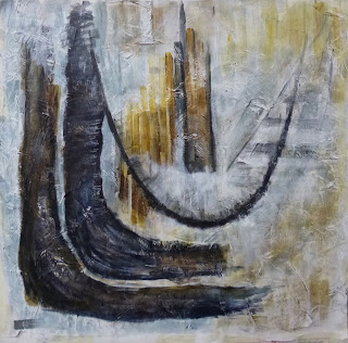
I spent most of the final session of Contemporary Painting Studio making corrections and changes to the largest newspaper collage painting in light of analysing the 'Catenary'  paintings of Jasper John .

Remembering the lessons from 'Reading the Paint Surface' of turning source material photos  and painting upside down or on their side ,  I  worked initially on a smaller scale copy of the painting from last week
 Working on the painting itself , I used white acrylic to block out the curves that weren't working and  added more definition to the 2 dark outer curves
 I then re-instated the inner curve  and  attempted to capture the finer patterns and details from the collage using more glazes and controlled brush-marks. As with most paintings, as you develop 1 area, you have to  change and balance another  . The 2 outer curves are too solid now and  I still need to introduce a larger scale of mark ( a very large brush is required!) But I needed to stop work at lunchtime to let it dry as I had to take it home being the final session.
After lunch, I  worked into the painting I started in Week 5 , extending the shapes  and patterns from out of the collage into the areas around. 
 Lucinda  usually  highlights a few  contemporary artists each week, this time it was Diana Taylor ( who she'd  already mentioned to me in Week 8) and Karl Bielik ( examples below from his website)  
I thought the name and paintings looked familiar  and so using the search function on  my blog, I found his had been one of my favourite paintings at the RA summer exhibition last year. 


 We  stopped work about 3pm and cleared  up then set up a mini exhibition of our  best work  and then had a 'private view ' and review accompanied by  Prosecco and nibbles ( my little cheese scones were popular). It was really  interesting to   discuss what worked , what didn't and see the range and variety of styles, I've learnt so much from members of the group and their approaches to painting.


I'd included the initial collages , photos and painted sketches  so I could see how my work has developed. In essence what I've done is to take  1 initial collage and using copies of copies have gradually  simplified  and  enlarged it into something quite different yet the original source is still recognisable. 


I've come  a long way since my initial panic and indecision with having too many ideas  in weeks 1 and 2 . 
The breakthroughs came with the move to monochrome ( which I've stuck with but am starting to add a restricted palette of colours ) and in collage .
Then the introduction to using glazes of  transparent colour ( and the decision to stick with acrylics rather than move into oil painting as I'd intended)  
With my collages and sketches on display in the corridor and not immediately accessible, I worked with printed copies of the collages applied to canvases   and then made  copies of those paintings which I also worked into !
In week 6 , reunited with my collages , I painted them with glazes and started to prepare a very large newspaper collage to work with . 
This was the focus of the last few weeks, the challenge of scaling up marks and how the composition and relationship  of shapes changes. After a certain point you have to react to the painting itself although I found it useful to go back to earlier incarnations  to work out where I was going wrong.

 So what next?  I've booked a 10 week class on collage at City Lit starting in January having just scratched the surface on its potential, I want to know  more. I had too much going on to commit to a another term of Contemporary Painting Studio ( and it was filled very quickly by those who missed out ) but I've the bonus of a 2 week course 'Painting Studio Time'  set up before it starts. I think the time has come for a large painted quilt taking on board the lessons learnt from  scaling  up. 


Monday, 18 December 2017

Contemporary Paint Studio Week 9: Coming Together ( and importance of Catenary)


A much more productive time in week 9 of  Contemporary Painting Studio  thanks to  thinking about what I wanted to concentrate on in the last couple of sessions and some  prep work during the week.  I was particularly pleased with the 2 Journal Quilts I produced (above)

My prep work included   taking a high res photo of the finished A3 painting that I was reasonably happy with and printing it out  on my A4 inkjet printer using 'poster' settings   at 3x3 and 2x2 sizes  in order to have the scaled up marks to work from 
The 3 x 3 pinned up on the screen was very helpful for working on my large scale  newspaper collage . I used burnt umber /ultramarine glazes to make greys , it's still a  bit heavy - one of the problems with working on a textured surface and I need to pay attention to the edges of shapes. 


The  section of old quilt I'd primed with gesso  was even more textured  so I worked with it, simplifying the shapes from the 2 x2 print. Again a limited palette of Paynes grey, raw sienna , burnt umber and ultramarine  with some white reintroduced in areas.  

The first item on my 'to-do' list was to prime the quilted collages I'd prepared during the week with diluted acrylic medium so that my paint glazes wouldn't  bleed/sink into the fabric. 
I'd printed out photos of 2 collages onto Jacquard Inkjet Cotton sheets ( 2 x 1 poster setting stitched together) attached to linen tablecloth with bondaweb then quilted with horizontal wavy lines. 

It took a couple of hours  to dry ( I'd do it before class another time!) 
For painting I used  Winsor and Newton transparent acrylic paints in Raw Sienna, Burnt Umber and Ultramarine   mixed with gloss medium/Golden soft gel and diluted with water  and applied with dry brush . I loved how  the brushmarks were retained.
I had a question from one of the other artists  in the class who paints with oils why I was using my own W& N acrylic paints rather than the acrylics supplied . Apart from being better quality ,  highly pigmented   and truly transparent ( which is the effect I wanted  to achieve) , the main reason is having  a lot of experience painting with W&N watercolours, I'm used to the colours and colour mixing . Every paint brand has it's own characteristics - I also use Liquitex heavy body  for impasto  and Golden  fluid  for  textiles. 
Jasper John Catenary (Jacob's Ladder) 
Earlier in the week I'd finally made it to the Jasper Johns exhibition at the RA.  I  was  pleased to see  more of his joint project with Samuel Beckett  which had been one of the highlights of the print exhibition at the British Museum and like Olga, appreciated his more recent, personal work  over the  targets and numbers ( while noting the use of collage....)  


I was particularly struck by the particular curves of his 'Catenary' series  and started seeing them everywhere and realising that a lot of work I admire contains similar shapes.  

Susie Koren View Seven 


 I realised that  there's a similar curve in this painting and that  one of the reasons the largest collaged painting isn't working yet is because the curve is wrong.  So I knew what I had to do in my final painting session . 


Wednesday, 6 December 2017

Contemporary Painting Studio Week 8 : Some things work, others don't


Mixed success in session 8 of Contemporary Painting Studio at City  Lit, only 2 more sessions left and the pressure is on.
 I started by cutting down my  huge newspaper collage to a square format  ( the offcut providing a test surface for  samples of paint marks , above)  and  taped it up on the screen with  my efforts from previous weeks on boards. 


I then took a sharp intake of  breath and  painted on the large piece -  a very different experience painting on a textured surface to a smooth one, detail below.

I  wasn't sure about  it so leaving  it to dry, I completed the small canvas I started a few weeks ago, making corrections that I'd worked  out by using photocopies. I'm pleased with it now, it has a real sense of space and mystery. 


The intermediate one however was not going well, if anything I'd made it even worse! 

Some application of inks  after a talk with Lucinda  and it's beginning to look better


We discussed the difficulties in scaling up -  how the large pieces were not yet working as the direction and dynamics of the lines are not in the same relationship as the smaller (successful )  collages where the space really works well. 
She suggested I look at the work of Diana Taylor ( below)  where industrial/ technical drawing of lines etc  can provide contrast with larger marks to give a suggestion of space. 


Next time the suggestion is to blow-up size of newspaper/collage materials as well as the mark.


Friday, 1 December 2017

Musa's Clinic Online Quilt Sale 02 Dec


I've donated  two 25cm ( 10 inch) square quilts , backed with  4mm felt and a hanging loop to the African Fabric Shop online quilt sale in support of the Sukuta Health Centre in The Gambia.

They both incorporate  Musa's Kola and Indigo fabrics which I've used in  many of my quilts from Tunisian Door to Fleet Mudflats ( I was  one of their first online customers , ordering fabric on Boxing day 1999! )  As with the conservation projects I've been involved with at Kew, a relatively small amount of money can make a big difference.

UPDATE. I'm pleased to say that these sold within  hours of the online sale opening  and will be heading off to buyers in UK and Qatar  soon. Thank You! 


Wednesday, 29 November 2017

Contemporary Painting Studio Week 7 - Scaling up continued


Using my time on the train journey to 'Contemporary Painting Studio' at City Lit  to prepare my ' to-do' list  is proving to be  productive ( although my stitching project is feeling neglected) . It's a bit challenging to cut out and glue pictures in an airline style seat although I do find that the seat next to me is left vacant as long as possible...  
My lists are always over ambitious but I achieved quite a lot of it in this session:  painting over large scale newspaper collage,  reviewing potential compositions  and exploring large scale marks on pre-painted surfaces 

The first job  was hanging the newspaper collage from last week back up on the screen easel - much better behaved now it has some substance to it than the initial roll of paper . Then it was a case of  loading my palette with a large amount of white acrylic paint and climbing up the step ladder  and painting with a large brush -  very satisfying.  I did one coat before coffee and another afterwards  so that after lunch it was dry enough to take off the screen  and I could concentrate on my other tasks! 


After morning coffee we had a quick  review ( 2 mins each) of everyone's work - we did  this in the second session  and it was really interesting to see how peoples ideas have developed  or changed in the intervening weeks.  We were asked to think about approaches used   by  other people  that  we found  interesting and we might use   in our own work.

As I hadn't started on  collage at  the previous review, I picked up on different ways this technique was used: working into photocopies  with paint to simplify shapes  and restrict colour palette;  combining photocopies in collages  with layers of tissue paper, working into them with paint and drawing (then enlarging and repeating the process).

I also was aware of the importance of format - in a couple of cases  we discussed how changing the shape and proportions  could alter the impact  and focal point of the painting  and the difficulties of scaling up from a sketch - do you keep the same format or change it?
Although I'd made the decision not to work in oil paint (  thanks to Amanda's session on glazing I  could achieve a lot of the same effects with acrylics) , there was much to learn from the many accomplished artists there who do use oils , in some cases what wasn't working and why. There were some very interesting layered backgrounds being  painted over and scratched into to reveal the underlying paint  and a discussion  on how to lighten  areas  with glazes without using white ( can lose translucency ). I remember that lesson from 'starting oil painting' class.     


After lunch I  looked again at my collages and sketches to review the compositions, to select what might prove interesting developed  into a larger piece of work. In week 5, I'd  started to paint into a photo of a collage applied to a painted canvas( above). It was over done   and I  wasn't happy with how some of it was working so had printed off a black and white and a colour copy to play with.

On the black and white copy  I started off by cropping to create a square format then using white  thinned acrylic  blocked out the areas I didn't like  and reinstated the inner dark curve, extended the outer one  with dark greys and introduced some breakwaters!


On the colour copy I made similar changes but instead of cropping , I first  extended the top part of the image with greyish blue paint to create the square format. 


Having rolled up my  large newspaper collage for next week, I then used the screen as in previous weeks for taping up sketches/ collages , including mark-making trials  and set up  an A1 sized newspaper  painted collage ( masked off for square format ) on an easel.  


My order of large brushes from Jackson's hadn't yet arrived ( it has now!)  but I made do with what was available and had an interesting time  applying an initial colour wash and then experimenting with different colour mixes and marks.


I found some of the underlying colour lifted off (note to self: less water more medium need )  and the textured surface provided by the underlying newspaper collage  reacted very differently to  primed paper( brushmarks were not retained in the same way and the paint was more opaque)

 I used up my paint applying  drippy colour washes to yet another newspaper collage( where I'd simply pasted a whole sheet down ) from 'Ways into abstract painting'. I'm seeing ghostly hilltop villages and am looking forward to working into it exploring the found shapes. 


But I shouldn't get too distracted from my principal task  for this weeks class which is getting started on my large scale painting!