Tuesday, 23 October 2018

Extended Drawing (EDAM) Week 1 : Surface Divides


 Week 1 of long anticipated 'Extended Drawing for Artists and Makers'   started with introductions to the  year long course but moved quickly to the first 3 week project with Amanda Knight ' Surface Divides'  . The main aim   was to communicate unseen environments using the act of drawing for speculative thinking, exploring illusory space.   
 In pairs, we were asked to describe (imaginatively!) what the interior  of various fruit and veg  might look like  and then draw that interior based  on your partners notes. 
As a botanist with 40+  years of experience  cutting up plants and  understanding of plant  structure and function   I found this extremely difficult ! How do you unknow  decades of knowledge? 
So it was just as well that  I was working from Sandy's playful and poetic  description ( I think he struggled with my rather prosaic description of the interior of the  radish! ) 
We were working  on A1 sheets of paper  with charcoal  to quickly build up  form  and marks - I enjoyed depicting  the velvety skin (' puppy-like' )  and the 'small hard seeds  dispersed like currants'  when I knew that they were dates  with a single stone !

 We were  then asked to draw a section as cutaway ( like old medical drawings) showing both exterior and interior at the same time  ( above)  before imagining an environment   of leaves etc . filling in the background ( below) 
After lunch , we got to cut open our  specimens and draw the actual interiors  using a variety of  media and techniques. I started off by applying  ink to the cut surface of the radish I'd described  for Sandy and then using it to make prints . If you zoom in , you can see the vascular  bundles in the thickened tap root  but it's very subtle ! 


I then cut open  some dates, drawing the fine fibres that surround the stone  contrasting with the thicker more solid skin.

I then played around  with taking rubbings of a torn paper edge  to represent the soft  velvety texture of the skin
Other people had more exciting material to work with, I loved the textures of the ' bitter  melon ' Momordica charantia   and worked with soft graphite contrasting with an overlay on tracing paper using a fine pen .

We stuck our very varied drawings on the wall   but didn't have much time to look at them ( particularly as I had to rush off for the train).  We were also introduced  to various   artists , looking at the pre-renaissance medical drawings of Avicenna , Aristotle  and Galen  and how graphic annotation had been used in illustration  by Leonardo  da Vinci to expand the level of information in a drawing  ( and using it as an element in it's own right to enhance the composition) 


The use of paper flaps and foldouts  for medical drawings  was also  looked at . 

 I  missed week 2  as I was in Puglia  on course 'Mapping a Sense of Place'  with Matthew Harris , but Amanda  has sent me the handout on constructing a personal folly   based on James Wyld's Great Globe'  and the paper architecture of Brodsky and Utkin 


I'm looking forward to what  tomorrow's  session brings ! 


Friday, 5 October 2018

David Tress: Structure and Expression at Lund Studios


  Last week  I was  back again in Lund Studios  on the long anticipated course with David Tress.  We crammed an awful lot into 3 days  with   painting  demonstrations   then drawing on location and putting it into practice painting in the  studio . As everyone says , besides producing such inspiring art,  David is an excellent tutor,  generously sharing his approaches  to painting   as well as giving individual  help and suggestions. While I didn't produce any masterpieces, I've very happy with  what came out of the processes and am excited about  taking it further into paint and textiles 

All photos here are of my own work . I took photos  of David's  painting demos  for my sketchbook  (he requested that all  such photos were for personal use only  not for publication/ sharing on social media )  

On day 1, after a demonstration  looking at the ways he makes paintings: the different elements , the balance between representation of space and light and taking risks,  we headed out into the surrounding fields to make some  sketches to work from . I was drawn to the strong shadows  cast across the fields; the curve of the land  and the fence lines in the middle distance.

I was a bit constrained in materials as I  travelled by train so had 1/2 imperial sheets of 300lb watercolour paper rather than the full imperial size he works  with but I did have plenty of acrylic  paint and brushes with me.  
We were encouraged to  start with vigorous marks to block in the  main areas of light and shade. When David came round , he liked the strong start I'd made  but suggested changes to the composition in the quick sketch below 

Changing the shadows so they became the focus and  introduced a sense of space and perspective made all the difference
A second demonstration   showing how he uses collage   ( ripping up paintings , placing pieces from behind as well as in front, stapling them to the board!) finished off the day. 
The second day  we headed off to  Sutton Bank  with it's spectacular views   and gliders hovering . I was glad I'd taken lots of layers ( it was  very breezy)  and settled on a bench with a side view of the 'white horse'. Where do you start with such a panoramic vista?! I did several sketches in pencil  and watercolour trying to work out the structures, light and shadow.


Back in the warmth of the studio , another demo by David  showed how he'd tackle the subject ( very different from the fields of the previous  day) with tips on horizon lines, middle distance, how lines work to give sense of perspective,  leaps in tone, the negotiation between different elements.  
After lunch I really went for it - ripping paintings up, slotting collage in, lots of use of a staple gun .  

It went through several reincarnations, getting fussier and fussier. David's suggestions were to introduce bigger brighter yellow in the distance and bold dark paint strokes  right across the painting ( shades of what I did with Ashley's help in 'Black and White' ) 

What a difference! Though without all the fiddling about  with marks and scratches , the foreground wouldn't have been so interesting underneath that bold  black mark.  I love  how this painting retains memories of the marks and  processes   involved, the 'palimpsest'  effect 
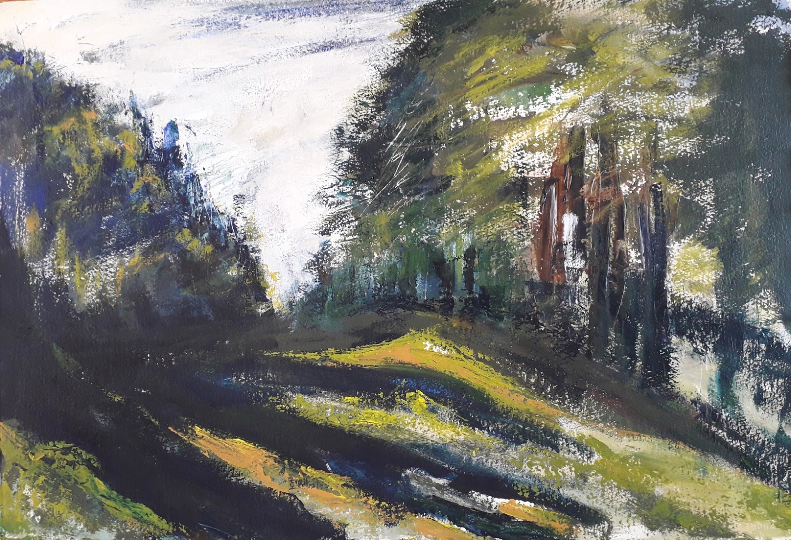
Day 3 ,  I headed back into the fields  around the studios for some more sketching, this time of the  light shining through the fenceposts and hedges. 


I just had time before a demo on colour mixing to block in the main shapes and tones. 
 During the course of the afternoon I introduced a bit of collage  and attempted to paint the negative shapes of the light areas into dark  rather than the hedges and fences themselves. It needs some more work but overall I'm pretty happy with the results.

The final  demos showed how different colour palette /tonal range  can give the same composition a very different feel    and  how  techniques he used  of blocking in the big picture could be used to on very varying subject matter.  He finished with the final poems on Autumn he'd been reading to us  throughout the course. 

So much to  think about and digest  but the take home message is big simple ideas, taking risks ( messes are not failures but possibilities  to disintegrate and rebuild)  and if in doubt go for a bigger brush!