The final session of 3 week project 'Surface Divides' involved moving into abstraction working from details and fragments of drawings already generated from the cross-section projects of the previous 2 weeks including supporting photos, objects and images. As I'd missed the second week, Amanda had helpfully sent me the handout and some pictures of other students work had been loaded on the course Padlet site which gave me an idea of what had been covered.
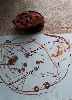
As the emphasis seemed to be on working from 'paper architecture' rather than the fruit and veg of the first session , I chose to work from a couple of photos from my Puglia course last week : a bamboo structure on the beach at Calafetente near Pologna San Vito and my drawing on fabric of a squashed plant pot , drawn without looking ( and I brought a plant pot with me!)
We looked a number of artists that demonstrated a sense or illusion of space and depth, use of tension or contrasts and looking at form and content both planned and accidental eg templates unfolding and ideas around navigation. I hadn't been able to get to the recommended exhibition of Julie Mehretu but I've seen and admired her work before , both in BM print exhibition and at Tate Modern . It was also good to have a reminder of composition structures.
We then spent the morning experimenting with techniques - wash (ink and acrylic so not working on pure white surface ) , monoprint , stamping, transfer techniques , stencils etc
Drawing into printing ink and taking monoprint than ink drawing over the top
Drawing with ink over 'ghost print'
Prints on tissue paper overlaid over drawing and transfer prints.
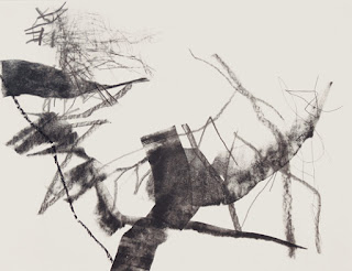
Transfer printing was my favourite technique, new to me and involved working quickly. On a photocopy of the bamboo structure attached to the drawing with strips of masking tape to act as a hinge, I painted the lines with acrylic paint and then flipped it over and rubbed it down. I loved the marks this method produced
In the afternoon we worked on a final piece up to A1 scale using layering techniques to give a flat surface ( the aim was to achieve some of the visual effects of layering without relying on collage or physical overlays).


No comments:
Post a Comment