Sunday 31 August 2008

August TIF ( and a meditation on stitch)

I couldn't help a wry smile when I saw the theme for this months 'Take it Further Challenge' was 'BALANCE' as I had just been diagnosed with Labyrinthitis after a bout of intense vertigo and dizziness caused by a viral infection. Happily this has now cleared up but what else could be the subject of my August TIF but the 'labyrinths' of the inner ear.
I searched for images on the web , thinking originally I would use the one above to tie in with the colour scheme but decided on the labelled b&w one below from the medical text book which looked like some exotic sea creature.
I printed out the image on cotton poplin and also on silk organza and then overlaid them , slightly offset, so the images didn't line up properly, giving a slightly blurred image.
I wanted a rough quality to the stitching in keeping with my feelings of becoming unravelled. Outlining the shapes on the top layer only became quite disorientating as I found I was following the wrong line, becoming sidetracked. The large tacking stitches along the labelling lines were more successful, holding things together.
Not a pretty or even very satisfying piece but thought provoking and very much about the process of matching stitch with intention. While I was sewing the long tacks, I was thinking how much I liked the mark they made and about doing more on future pieces. It's actually quite difficult to make such large stitches regular and I was questioning whether I actually wanted them to be regular and if not, how I could sustain that irregular look as I became more practiced in that stitch? I used to make quilts with very fine 12 stitches to the inch quilting then moved to using heavier threads for a bolder effect. How can I sew in a crude, random way when all my programming is to achieve a small, neat stitch?

Monday 25 August 2008

Drawn from the Collection

For the double anniversary of wedding and the first year in our new home, Ian and I treated ourselves to a nice meal at the Rex Whistler restaurant at Tate Britain ( subsidised by a timely £50 Premium Bond win ). We dined elegantly , surrounded by the mural 'In pursuit of Rare Meats and then feeling suitably mellow after sampling the award winning wine list, ventured out into the galleries in search of Turner watercolours. I was keen to see his work again after my recent painting course (there's currently an interesting interactive display of his methods). However, on the way we were distracted, first of all by this wonderful Henry Moore sculpture, carved out of Green Hornton Stone, so different to the monumental bronzes we saw at Kew and apt since we've recently been in limestone country.
(Henry Moore: Recumbent Figure 1938)


(Edward Wadsworth: Dux et Comes )
I lost Ian at one point as he was absorbed looking at the paintings in the same room , particularly these 2 (above and below). Wadsworth was new to me but Nash is an old friend (his 'Winter Sea' is one of my all-time favourites).

(Paul Nash: Voyages of the Moon )

Also on the way to the Turners was an exhibition of drawings from the Tate collections. I've always tended to leap straight to paint after only cursary attention to drawing ,(probably because I love colour so much). However since my recent course I've been drawn back to line after experimenting with acrylic inks used very freely. The display of drawings was very diverse from finely detailed traditional pencil sketches to contemporary animation and monoprints.
One of the first drawings in the landscape section that caught my eye was this preparatory sketch by James Ward for his large painting of Gordale Scar. There's always a shivery sense of connection when you realise you've been trying to capture the grandeur that other artists in past have struggled with (Turner also painted here)

(James Ward :Sketch for Gordale Scar)

(Wihelmina Barns-Graham : Eight lines Porthmeir)

I like the subtle simplicity of the piece above - something to aspire to. The lines are softly blurred in places (the medium is chalk).

This charcoal ( and chalk) vigorous drawing of Peterbough Cathedral (below) was placed next to a very intricate drawing by Turner of Ely Cathedral. What I love about this is that it speaks of space and hints at delicate stonework and tracery yet is achieved with bold line and subtle rubbing out. It lets the viewer fill in the rest.

( Dennis Creffield : Peterborough Approaching the West Front )

Chalk and rubbing out of marks were also used by Tacita Dean on her huge blackboard drawings. The use of multiple images give a wonderful sense of motion and although mainly drawn in outline, there's a hint of volume given by a small amount of chalk left after erasure. Quite wonderful.

(Tacita Dean : Roaring Forties )

I came away buzzing. Besides some notes in my sketchbook to jog my mind I was excited to find on the Tate's website that all their collections have been digitised and you can search its database in many ways (including every page of Turners sketchbooks) - I could browse for hours. I've also just signed up for their online course which looks at a variety of artists' methods with excercises to try these techniques for yourself. A great follow up to the Studio Journal Course and a bargain at £20.


Friday 22 August 2008

Festival of Quilts II

Sue, Gunilla and I travelled up first thing Saturday morning to the Festival of Quilts. Almost the first quilt I came across which I wanted to photograph in the 'Elemental' section was this one - which turned out to be Gunilla's prize winner!! I sought out Gunilla to tell her ( she had no idea!) - it certainly set a high standard for the viewing right from the start. I viewed the competition quilts first as I knew that once I'd seen the quilts in the galleries, there would be no going back. It was great to see quilts made by friends and people I knew and to see how their styles were developing. With many quilts, I took photos , looked at the catalogue and then had that 'of course 'moment when I realised they were by quilters I admire (including Kate Dowty, Annette Morgan, Stephanie Redfern)
I went to the talk by Susan Brandeis on 'Living the Creative Life'. Not too many people first thing Sunday morning which was a pity. I've heard/read most of the suggestions before but reinforcement is always good. The importance of taking risks and working through quantity toward quality resonated for me, also the need to work at your own pace and avoid comparing yourself negatively to others. I looked at Susan's quilts afterwards- some of them I thought a bit 'busy' but I liked her recent work particularly (me being a botanist!) those with a botanical theme. I know from experience how difficult it is to capture the essence of plants without getting overloaded in the detail. Her quilt of equisetums showed this quality admirably ( and anyone who is using digital prints in such a subtle and imaginative way get my vote)
But as many people have said in their blogs already ( do read Olga's thoughts) once you'd seen Dorothy Caldwells work, nothing else compares.
I looked at her pieces again and again, talked to her, and tried to make sense of them by sketching them. Her work is equally mesmerising on a small and monumental scale, and the real magic is that you can't tell where the marks made by resist/ discharge and stitch start and finish. Mind blowing.
I was relatively modest on the purchasing front, sticking (mainly) to my shopping list of wadding, silk organzas and variagated thread ( machine and cotton perle) But I succumbed ( as I often have before) at John Gillows stand. After making him laugh with my adventures in Iran ( (he'd advised on textile possibilities, some of which I'd managed to follow up), he showed me a bandhini (shibori) turban length that I was unable to resist. It has many different patterns on it (flowers, stripes, checks, triangles, paisley and even a Persian style tree) The challenge now is to work out how I can display its 14m length to best advantage.

Wednesday 20 August 2008

Festival of Quilts I

I've been to all 5 of the Festival of Quilts at the NEC so far (including coming back straight from my honeymoon but then Ian knew what he was taking on ) This year was the tightest turn round ever with arriving home from painting in the Dales on Friday late afternoon and being picked up by Sue 7 am on Saturday! I had a great time as usual, fitting in some retail therapy and looking at quilts in between catching up with friends ( many from 'blogland' ) I looked at the competition quilts first before the gallery spaces as I knew once I saw Dorothy Caldwells work I wouldn't want to look at anything else. More on that in another post.
I had 3 quilts on display so now they've been exhibited I can reveal them in their full glory. This one (Sky, Sea, Fire, Stone) was my entry for the Guild Challenge 'Elemental' and was started in an Angie Hughes workshop on using lettering at last years CQ summer school. It's built up of layers of organza, muslim and scrim (including some digital images) overprinted with words from printblocks ( so there is some acrylic paint in it!) It was hung in rather a dismal corner with a wooden bench in front next to a very bright quilt so it looked even more subdued. The judges comments were mainly complimentary apart from it could have done with more quilting which I agree with.

'Tideline -after the storm' was entered in 'Contemporary Small ' category. It is densely hand and machine quilted then overpainted with acrylic paints. It seemed to generate quite a lot of interest and the judges comments were mainly excellent or good. I was thrilled to find that it had been awarded 'Judges Choice' by Steve Lockie as favourite in the whole show! And finally there was the opportunity to display my 'Thin Blue Line' quilt 'Gythion Glow' just returned from exhibition at Dudley Art Gallery and Museum on the Contemporary Quilt group stand. While I think it is a well balanced and executed quilt and I enjoyed making it , I'm too close to it to appreciate it objectively. I've therefore been surprised at the amount of admiration it has gathered, to the extent that someone is buying it! It will however go on display in any further exhibitions, not least because it features as one of the postcards. I'm in a bit of a glow myself.

Monday 18 August 2008

Extreme Painting

Back at home now after nearly a fortnight away visiting cousins and going on painting course in Yorkshire followed by couple of intensive days at the Festival of Quilts ( which will be another post). After a couple of days relaxing and catching up near Ripon ( including a tour of the Black Sheep Brewery and witnessing 1100+ year custom of the Hornblower, complete with mummers play) we headed off to Malham Tarn Field Centre. The centre is fairly basic but confortable and the food was excellent especially the trout caught by the fly-fishing course! The main ingredient of the painting course was the weather - it rained all week with just the occasional glimpse of the sun. Several members of the group were experienced 'extreme' painters kitted out with large fishing umbrellas, shelters and even an inspired arrangement of ground sheet held up with trekking poles. I had none of these except good waterproofs but as the week went on became more intrepid, accepting the effects of raindrops on paint as an integral part of the painting experience
Our first outing was near Keasdon looking out either to the 3 Peaks or Vale of Bowland. You could see the rain clouds advancing but even so were freqently caught out by sudden downpours. I concentrated on quick sketches which weren't so badly effected by a thorough drench.
Back at the studio I fairly quickly got back into using acrylics on paper (used mainly 1/2 imperial size sheets of Saunders Waterford 300lb paper which is almost like card )
Our next excurson was to Arncliffe which for me had more potential in terms of patterns of walls and scree ( I find distant vistas less appealing and difficult to interpret) I did a few studies on the spot on watercolour paper and started a larger piece which all went horribly wrong when back at the studio. I have lots of photos and other sketches to draw on for future textile work, perhaps one of the reasons the painting I started didn't suceed was that it would work better in another medium. Good excuse.
On the course I did 3 years ago, I did a drawing of the 'dry valley' above Malham Cove so already had my painting spot chosen this time. We were literally on the Pennine Way, with lots comments from walkers from 'Why don't you take photos , it would be much easier' to ' I'd like to take up painting, it must be so relaxing'.
I meanwhile was trying to brace myself on a slope with my easel threatening to take off at any moment ( my easel arrangement is a drawing board with a metal plate which screws onto a lightweight camera tripod), paints rolling around and frequent spills of the waterpot ( an ex 'mango chutney' container donated by the Field Centre)

I was rather pleased with the effects achieved with acrylic ink drawn with the dropper and dribbled over the page ( and my waterproofs - I now have an official 'painting cagoule' ) I also did a close-up of some of the rocks using palette knifes ( the blade unfortunately fell off my favourite one which I use for quilts so I had to use a far daintier one). It still needs a bit more work to overcome the resemblance to bad teeth.
Probably the most inspiring place we went to was Gordale Scar ( and the most satisfying painting, carried out mainly on site). Initially as it was pouring with rain, we set off just with sketching gear but found it was completely dry under the rock overhang. After coffee and a look round Katherines studio in Malham ( her more abstract canvases are stunning) several of us headed back with more serious amounts of kit.
I've really enjoyed using acrylic inks ( especially white)and now have a large shopping list for other colours ( and a new palette knife ). Maybe not the fishing shelter,I'm not sure I'll retain my intrepidness in Brentford although I'm inspired to tackle the river and boatyard here.

Tuesday 5 August 2008

Interpreting the Landscape in Acrylic and Collage

We're heading 'up North' tomorrow to Malham Tarn Field Centre, Ian to do a course on History in the Landscape and I'm doing a painting course with artist Katherine Holmes. In sorting out my art materials, I came across the paintings I did on a course with her at Malham in Spring 2005 which started me off on the route of painting with acrylics on fabrics . It was my first experience of experimenting with various acrylic media so as with anything you're new to , there was an element of frustration that the results didn't necessarily match up to the fun of the process. Looking at them with fresh eyes , there's parts of them that I rather like and give me ideas for how to progress this week. This one is the smallest at 1/4 imperial. While I like the textures (acrylic media scratched into and painted over) it really needs to be bigger to carry it off
Elements of this are interesting, I enjoyed the combination of torn paper collage and pastels and working larger at 1/2 imperial was less constraining.
These 2 details of an 1/2 imperial painting of the rockface at Gordale Scar are the most interesting . I started the painting in situ - nothing beats direct observation. The left hand side of the painting (not shown) doesn't work that well - I think I was probably trying too hard to do a 'landscape' painting when what I was drawn to was the abstract shapes and colours. I think over the last 3 years through working with acrylics on fabric I've got better at abstraction - perhaps as there is less emphasis on making a picture.

In a way, this drawing is probably the best thing I did. I normally skim over the drawing stage to dive into colour but something about working with an ink brush pen on watercolour paper and drawing what was just in front of me absorbed me. I was sitting on the edge of a path drawing the other side of the valley and only gave up when rain stopped play!


Painting equipment 2005 (including the kitchen sink or equivalent)

Sunday 3 August 2008

Sketchbooks and the Compost Principle

For the past few weeks I've been working on some of the exercises as part of an online 'Studio Journals' course. Several people had questioned whether I needed this course having kept a variety of sketchbooks over the year. I've actually gained a great deal : an interactive forum for sharing experiences;practical tips; interesting new exercises and approaches (although some like using clipart didn't appeal as I prefer using my own images). It's also made me think about my whole preferred design process, how I use sketchbooks and areas where there is room for improvement! One of the suggested principles of the course was that you keep one Studio Journal to gather everything together using the ' compost method' so that ideas from one project can cross to another projects. Rather tongue in cheek,( and not really in the spirit it was intended) I can also use this 'compost principle' to justify my use of multiple sketchbooks following the practice of composting in this household!
Ian is in charge of the 'Great Compost Experiment' which consists of :2 large 200L black compost bins( one full and left to rot down, one 'active' being added to); 1 dustbin of sieved compost; 2 small green containers for veggie peelings etc ( one indoors, 1 outdoors); 1 bag of paper shreddings; 2 sacks of clippings /green waste from garden. 
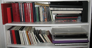
So pushing this analagy, my equivalent of the containers for kitchen waste, garden clippings and paper shreddings (the 'gathering ' stage) are my current selection of sketchbooks pictured above. These are: 2 x A5 (1 portrait, 1 landscape format); 1x A6; 1 x A4 cartridge paper excercise book; 1 x A5 watercolour paper sketchbook. My most frequently used is the A6 which I keep as an illustrated diary when travelling, notes from exhibitions , lectures etc. The A5 sketchbooks tend to have a more traditional function eg I'll be taking these for drawing in situ on my painting holiday later this week. It's useful having 2 on the go so that when doing quick sketches,you don't have to wait for the page to dry before doing another. I've fairly recently discovered the very cheap but good quality A4 excercise books which I use as scribble pads taking notes on courses, sketching out ideas , ripping out pages for other purposes. Doesn't matter if it gets dribbled on when taking notes for dyeing for instance
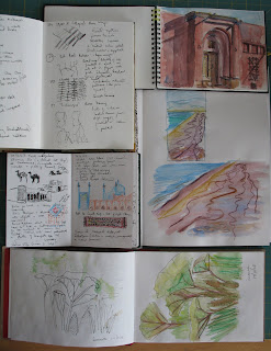
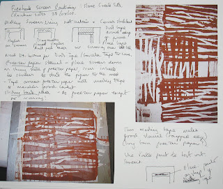
Last year, I started keeping an A4 spiral sketchbook as a 'lab book', recording what I'd done for particular projects AFTER I'd completed them eg July Take it Further challenge on Persian Archers (above), notes on screenprinting course( below). It's a useful process to review what worked, what didn't and to distil and summarise. Although not an 'art journal' , I'm happy to show it to people and it acts as a compact portfolio of my current work. This, using the compost principle, is the equivalent of the dustbin of sieved compost.
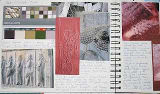
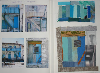
I started a new A4 casebound sketchbook for the Studio Journal course. I have used it for the exercises and am beginning to realise that although I won't use it quite as intended, it could have a role to play for capturing ideas. Currently I have photos stored on the computer in an 'ideas' folder and inspirational articles and pictures from magazines stored in looseleaf binders . In one of the colour excercises we did, I combined photos with scanned copies from my A5 sketchbook and found matching swatchs of fabric (below)

Of course in the compost scheme of things, this is the black compost bin where the breakdown and transformation of materials takes place, the core of the process. As up until now this process has mainly taken place in my head , it will be interesting to see how useful I find committing ideas to a journal.