Wednesday 29 June 2016

Inspiration from Faversham Open Gardens


A very enjoyable and interesting Sunday afternoon  in search of  inspiration   at Faversham Open Gardens. Lots of plants for sale in the market and  discovery of new places and routes through the town - had no idea about this original Georgian shop fron behind the Fleur de Lis Museum.


 Among my favourite plantings : a  narrow courtyard  garden; a wild flower meadow ( yes really!) and a tall ,well-stuffed herbaceous border of architectural plants


  Unusual planting ideas: a pallet 'dresser', a school desk  and succulents hung on the wall

 Pots and containers ( sometimes of quite large specimen  plants)

 Raised planters ( lots of veggie ones made of sleepers but these were more  stylish, particularly liked the ones at Ethelbert Primary School  and  the  children were very proud and enthusiastic about their crops!)

 Sheds/ Summerhouses  in small spaces gave us food for thought  when  we got home, looking at our space afresh.
 A few weeks ago while attempting to put a rotary dryer spike in the lawn , we discovered that it would only go in an inch!  Our garden basically  consists of  decking  and a thin skin of turf over rubble, no soil, so  we're having to rethink our ideas. As we'll have to import lots of soil ,hard landscaping with lots of pots and raised planters ( and possibly a  studio shed) seems the way to go. I'm  planning to do a short garden design course at City Lit in the Autumn.

Friday 24 June 2016

Reading a Paint Surface 4: Working on 2 pieces at once.

   My favourite section so far on the current  piece of work on 'Reading a Paint Surface' at City Lit.  I have strict instructions no matter what else I  alter to leave this alone. The earlier exercises paid off - the layers and textures that have accumulated are so subtle yet interesting  and I love the hints of unexpected colours at the edges . Coloured grounds rock!!

 Arrived at the classroom yesterday to find easels with enormous boards (A0)  set up, larger than I could lift ( love the accidental marks) . The idea was to have 2 paintings going at the same time, side by side , using different methods on each. Some people started 2 new paintings  and a few besides me were continuing with  one  we'd started last week

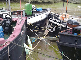
 Having worked  from a photo upside down last time, I now was working on it sideways  so it would fit on the board, then put a drippy green cast  acrylic ground on a second piece of  A1 paper  and for my subject was  zooming in on the middle section.
Once dried I added some areas of orange underpainting that had caught my attention in the photo


Over the  day , I built up layers of oil paint glazes - I particularly like the section below. It will need a lot of work next week concentrating on the negative shapes between the boats. I might work on it upside down as well - it's getting a bit 'boaty' rather than concentrating on the shapes.  It's working title is 'Green Libra' ( the name of the boat)  and  Tony's  suggestion last thing was to put on a layer the same colour as the brushed over lettering  and work  into that next week. 


Meanwhile  my first job on 'Red Libra'  was to knock back the background with some paler glazes - once dried the orange-red ground  was too prominent .  In various critiques everyone loves the middle section and the implied shapes of the tops of the boats  so that is being left  but the dark areas top right are too dominant.
Another critique, pairing up with another student , this area is still not working so suggestion was to return to source photos - the boat wasn't in the  right position.
Much better now I've  corrected it  and I'm liking the remainder of the shape that was left  from before - this is where the responding to the painting itself is beginning to kick in.
One other criticism was the need to vary the brush marks in different areas of the paintings. This week   I was really struggling with the brushes provided - next time I'll be bringing my  own in!
We had an inspector observing the class  - it was a bit disconcerting as she listened into our conversations  ( she  didn't know anything about painting). She did like my colours though, especially the purple.

Very tired  when I got  home  as besides standing at the easel most of the day, trains were delayed  because of flooding trains and they stopped people getting on the platform as they were getting overcrowded .  There was then  a last minute dash for the train and  I had to stand until Rochester.  Getting off at Faversham found Ian had been in the same carriage!! ( I did ring his mobile but he  hardly ever has it on).  

Tuesday 21 June 2016

CQ Summer School: Image Transfer at Hillscourt, Birmingham

A lovely weekend in excellent company at Contemporary Quilt's Summer School  held at Hillscourt  Conference Centre near Birmingham. The first thing I saw was all these delightful orange Hieraceum's, 'Fox and Cubs' . There was also some interesting woodlands and grasslands - I spent a peaceful half hour on Sunday sketching this holly hedge and oak tree   before breakfast.
We were here to work tho'! I was doing Annette Morgans' Image Transfer class ( I'd originally booked to retreat but I  would have been 'Billy no-mates'  on my  own  so was happy to join the workshop)  and learnt a lot , particularly about the versatility of t-shirt transfer paper

 Accommodation and food was excellent and  we had very generous table allocations to spread out  - no encroachment here!
 We started with paper collages from magazines,  fused to Vilene then stitched and painted

  Difficult to believe this started life as scaffolding, Chelsea buns and carrot sticks! ( the one above is scaffolding and watermelon)
 These  collages were then scanned and printed onto t - shirt transfer paper at different scales and  have the potential to be used  in a variety of different ways. I'm looking forward to combining prints of details of my stitching with photos of  ropes on boats.
 I'd brought a couple of photos I'd printed onto cotton or silk - these combined with the more intense colours of the transfer prints  offer some interesting possibilities

  On Saturday evening we were given a section  of old map and a piece of hand dyed scrim and asked to think about how we might use them with some interesting, varied results :cut up, stitched into, collaged with other pictures.
 I  was lucky enough to get some sea so  cut it into into  2 sections after copying it and playing around with  different ideas. The one above is  a work in progress , I want to add to the blues from my stash and possibly add photos from   Quilter Guild  AGM earlier in the year as the map is of Llandudno!
The sea I added to a surface of dyed linen scrims in an approximate grid.
Using old maps has given me some ideas for International Threads 'Sign and symbols' quilt I have yet to start. With all the  marshes and orchards around Faversham , there's a  large  variety of marks  to choose from.

Thursday 16 June 2016

Reading a Paint Surface 3: Selective Engagement, Contextual Oblivion


Another absorbing, frustrating, envigorating class at City Lit, this week using our own source material, practising how to select subject material that engages from secondary sources ( photos, drawings) by painting out areas on photo with white acrylic, turning upside down  etc. Next week we'll start working on 2 pieces at once - this piece is of sufficient interest to continue  with.
 my second piece will have a different low- key ground  in contrast to red/orange( again).

Session started with looking a paintings of a variety of artists  and their approaches, what is not painted but the mind fills in. Many new to me but worth further investigation: Christian Hellmich;Richard Diebenkorn;frank Auerbach;Holger Kalberg;Kyoke Kanda;Nock Goss;Phoebe Unwin;Thomas Mullenbach;ZhangEnLi.

In haste, still to finish packing for CQ summer school tomorrow!  


Friday 10 June 2016

Reading a Paint Surface 2: Colour, Pinholes and Drawing the Spaces


Week 2 of ' Reading the Paint Surface' at City Lit  started  with the  scene of our previous weeks endeavors partially covering  the still life arrangement, a playful hint of what was to come - using a small  hole  in a piece of paper to look at the objects while we painted them!

  After an application of yellowish acrylic paint to seal the surface of the paper  we built up   a textured  background using a couple of other colours of acrylic . I kept  mine fairly simple  with scrapes and brush-marks, others  really went for it with  dribbles, palette  knife marks ( and a Richter-esque scrape with a palette in 1 case- I wish I'd thought of that!)  A brief coffee break was allowed while they dried and we set up palettes for oil -painting
Using the oil paints we mixed a light, mid and dark tone ( in my case a pale peach, red and purple)  and used these to  paint what we could see through a pinhole in the paper  ( the  stage above  shows 2 overlapping views)  The idea was to build up a picture in reverse of normal practice where you finish by putting in the detail, here you were starting with it!
As I haven't painted with oils  since  I was at school, this proved an additional challenge! I was also beginning to regret the choice of red as a mid tone ( I should have  remembered the lesson learnt while doing my 'red boat ' journal quilts -  it doesn't 'play nicely'). In feedback tutor was pointing out how the eye fills in the detail  , finding shapes in the background like the rest of the vase
After lunch, a whole group crit  which was incredibly valuable, looking at each others work and weighing up what draws your eye ( and to leave alone )balancing with areas that need more work.
The verdict  on mine at the stage above was  liking bottom left  and  the top ( apart from the hovering  white oval)  but to lose the 'stripey cap' in the foreground ( it's actually the  coffee pot !)

                                     
We were then encouraged  to add some more colours - I mixed some green  for the bottle but it really wasn't  working so I wiped it off ( the advantage of working in oils) .  The tutor really liked what was left , it had a real translucent quality but  said ' enough of the red period', that I now needed some cool colours  to  alter the temperature  so I mixed some blue greys for the shadows.  


 That made all the difference  and filling in the spaces around the objects tricks the eye into finding the shape. Magic!  Next week we're to bring in objects / secondary sources to work from.