Sunday, 16 March 2008

March Take it Further - A Bit of Fluff

Had a very productive, creative weekend. On Saturday there were 2 inspiring and thought-provoking talks at the Quilters Guild Region 1 area day followed by a visit to the V&A museum to drool over the wonderful ikats. They reminded me that I have a couple of ikats bought from John Gillow that I should get round to re-hanging - they'll go very well in the 'Parlour'. Today I've been finishing off the stitching on several test pieces and painting them (more on that in another post) and putting the finishing touches to my March 'Take it Further' piece based on a Photoshop altered image of my husband's chest hair. I decided as the theme was concentrating on the small details, that I would zoom in on particular areas , as if with a magnifying glass.

Finished piece ' A bit of Fluff'. The image was printed on cotton poplin treated with 'bubblejetset 2000' as were the close-ups, placed on 'select' weight polyester wadding and free-motion quilted with variegated threads . I cut out out circles from the magnified images and wrapped them round wadding ( polyester 'request' weight from wadding sample pack) and sewed them onto the quilted background using needle-turn applique. Metallic cord was couched down on these areas with zigzag stitch.


Detail of couched threads. The edge of the piece was finished with the same metallic cord.
Overall I was pleased with what I achieved. I learnt from my February challenge and instead of trying to make it up to A4 size, just trimmed it down. The only thing I might have done differently is to leave some areas unquilted to give more variety in texture.

Tuesday, 11 March 2008

CyberFyber Exchange

Over a week since I last blogged - standards are slipping! Last week I received this postcard from Susan Lenz as part of her Cyber Fyber project - I now need to make postcard to send for her exhibition . Great idea! Its made using an embellisher - not something I've wanted to have a go at myself but lovely to receive. I'm planning something painted in return.Besides making some headway on my March TIF challenge and on a piece based on cranes in Brentford, I've been teaching an orchid seed sowing course and taking delivery of some brand new bookshelves for the 'parlour' . I've been having a happy time unpacking some of the book boxes that have been in storage and trying to be ruthless about rationalising it ( as I did with my fabric stash a few weeks ago). I had an editing session before they went into storage but I've moved on so much just in the couple of years since then. Where's the best place to get rid of dated quilting books ?(some might count as antique!)

Monday, 3 March 2008

Take it Further March

The concept for this months TIF challenge is 'the little things , the small moments , the details in life' which appeals to me rather more than the colour palette (particularly as the colours on the screen were difficult to reproduce in printing )
I thought initially of all the small plants I work with and views down the microscope which has been a source of inspiration for many pieces. The 'bryophyte' quilt below was made as a leaving present for a member of staff who worked on mosses, based on photographs manipulated in Photoshop
One of the photos used was of an aseptic culture of the threatened moss Orthodontium gracile

Now you might think that the images below, manipulated in Photoshop, are also botanical in basis. Wrong! I was looking through some photo files for something else when I came across some pictures I took of my husbands chest hair! I have his permission to share them with you but I won't embarrass him by showing the original photos - these have had multiple filters (including swirl, cutout, find edges) and colour balance/hue/ saturation adjustments applied.


At one time, my work was my life ( with a bit of quilting on the side) and I suffered as a result. I was just thinking that in choosing an observation of my husband as inspiration, in preference to a plant, that this reflects a healthier work/life balance. And just as beautiful.

Wednesday, 27 February 2008

Take it Further February (or Lessons Learnt )

In previous posts I outlined my ideas for February's TIF challenge based on the idea of combining the adult and childs's view of an antique chair I used to use as a den -' When I was small enough'. I'd taken photos and played around in 'Photoshop', settling in the end for working with the 'neon glow' effect as that also matched some of the colours in the challenge palette.
'Adult' view of chair ' Neon Glow' filter

Combined adult and child viewpoint 50% opacity 'Neon Glow' filter

The problems started mounting when I attempted to translate it into fabric - to the point I think I can now construct a whole list of 'how- NOT- to- do- it' hints. It started innocently enough with printing off 1 image ( adult view) on cotton poplin and 2nd ( child's) on silk organza to replicate the image above. Only the organza only takes up a certain amount of ink and the image was a blur with no shape to it ( interesting effect tho' like hand dyeing - I'm sure I can use it for something else )
Lesson 1. Results achieved in Photoshop are not necessarily directly transferable to fabric
Lesson 2. Just because it's worked before dozens of times before doesn't mean it will work this time!
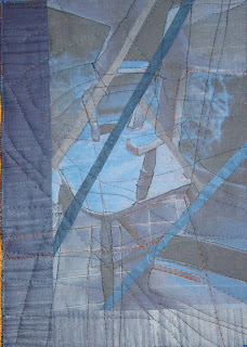
TIF Feb ' When...' Side 1
Then I thought I'd try combining the images physically so printed out the childs view on cotton poplin too. I played around with the images printed on paper first , cutting up and recombining ( something I've done very effectively before). I liked the effect but the problem with doing it in fabric is the seam allowances and shrinkage . So I added in strips of indigo fabric between but started losing the clarity of the image I wanted to achieve . I couldn't decide which combination I liked most so continued with both.
Lesson 3. Applying excercises in paper to fabric are not straight forward - think seam allowance
Lesson 4. Don't dilute effort - choose strongest image and go with it

TIF Feb 'When' Side 2
The problems didn't stop there - no I dug myself in deeper!
Despite adding in extra strips ( which didn't work anyway) once straightened up, the pieces were way smaller than the A4 size I wanted to achieve for my Journal Quilt. So I added on a border to bootom and side - only it is obviously an add-on and not part of the design.
Lesson 5. Design is all - don't add on superfluous parts to achieve the 'correct' size.
Lesson 6. Sometimes a piece has its natural size and shouldn't be forced

As I had 2 sides, I decide to make a double-sided piecec as I had done for January TIF , outlining shapes with quilting first from one side , then the other. Only a cut up image does not give strong lines and structure to quilt round. Result = mess. Which is worse, side 1 or 2????
Lesson 7. Repeat lesson 2 ( just because it's worked before....)
Although I'm frustrated that my ideas didn't work out in practice, I've certainly learnt a lot from this challenge so I guess it's been successful even if the final result wasn't !!The main take home message for me is:
Lesson 8. Less is more - don't fit too many ideas into one piece.
I thought I'd learnt this lesson a long time ago but it seems a reminder is due!
Thanks for all the sympathy for my dental problems - I'm now on my second course of antibiotics after a visit to the doctor ( with swollen glands and still feeling grotty). Apparently I should have had 2 different ones initially to deal with both aerobic and anaerobic bacteria so job only half done.

Saturday, 23 February 2008

Cranes

Since the trip to Iran I've been thinking of getting a digital SLR camera. I've finally succumbed to a Pentax K100D - a good price, excellent reviews and even takes the lenses from my faithful Pentax Super A. For many years I took just 35mm slides but discovered the delights of digital soon after I bought my PC and have been gradually moving up the compact scale. I've been pleased with my Canon powershot A610 but at times in Iran was frustrated by its performance particularly at low light levels and in museums. Seeing the kit (and results) of some keen photographers on the trip made me want to return to SLR and I've been having fun today trying it out. I'm a bit concerned there appeared to be a mark on the pictures in the same place when I loaded the images up on the PC- have to look at the manual in more detail tomorrow and see how the dust removal function works! My first exploratory shots were of the cranes on the GWQ building site in Brentford which I pass every day on my way into work. It made a change to see them at rest instead of whizzing about. I then made some alterations in Photoshop, in some cases applying filter upon filter so it bore little resemblance to the original. It's important to experiment (=play!)
Cropped, minor alterations in contrast, brightness and saturation

As above with filter 'palette knife' applied.


As above with colour balance altered


Monday, 18 February 2008

Greek Blue

I'm currently feeling a little sorry for myself as I'm on antibiotics for an infection in empty socket following wisdom tooth extraction. 3 visits to the dentist last week didn't do the trick despite cleaning out the site (without anaesthetic) and the continual taste of iodine. No alcohol allowed so to cheer myself up, I've been fishing out quilts and pictures and deciding on places to hang them . It's given an opportunity to reappraise and look what direction I'm going in.
'Sea Stars' has been hung in our bedroom - this dates from 2002 and my first experiments printing using the computer, combined with Thai silk 'wacky stars'. At that time I was using iron-on transfer sheets ( I soon moved onto Bubblejet set as I don't like the plasticy feel and the difficulty of hand stitching ) and I hadn't yet learnt about increasing colour saturation. That said I rather like the subdued blue-green, it's a colour I keep coming back to, being part of the colour palette of Greek Doors. I have so many photos and sketches of the infinite variations of peeling blue/green/turquoise paint, collected over several years and trips.


Also out of storage now are my travel sketch books including this watercolour from April 1998 on a Ramblers walking holiday in the Peloponnese. It was 15 minutes snatched during a coffee break in a village high in Taygetos mountains near Sparti before a walk down the Anavriti gorge with flowers everywhere. It's not my usual strength of colour - probably as it was near the start of the holiday and the pans were a bit dry ( and cold - there was snow around)

I did the same trip with Ian in 2006 and I was delighted to find that the same crumbly set up of doors and stairs was still there and hadn't been restored as I feared. This time we walked up the Gorge at our own pace ( botanising is a slow process) with spectacular views and lots of orchids and had a Taverna lunch overlooking this gem. I didn't sketch it this time but looked for a long time absorbing the colours ( while stuffing myself with courgette fritters).
I've driven by colour ( I'm afraid I tend to skimp on drawing ) and can 'carry' a colour in my head - a knack that a friend who shares it equates to having perfect pitch in music.
I wonder what you'd call it and how common it is?

Sunday, 17 February 2008

Selling the family furniture

I took these photos in my old flat in January 2006 of my antique furniture before it went into store. It's recently come out of storage , delivered to our new house, but I've come to the decision to sell most of it - its being auctioned next Tuesday by Chiswick Auctions.
From when my parents were first married in the late 1950's, they bought Victorian furniture as it was deeply unfashionable ( and therefore affordable) but also more to their taste than modern pieces and ironically was more in scale with the 60's bungalow we lived in. When Dad died in 1995 ( Mum died in 1987), it was valued for probate, some of the pieces were sold, my brother took some and I kept about half as it was not only lovely furniture but had lots of associations with growing up. Meals around the dining room table except Sunday high tea when we were allowed to eat watching the TV (Shari Lewis and Lamb Chop, Ski Sunday) seated at the walnut card table. I was glad to see the back of the deeply uncomfortable buttonback chairs tho'.
The furniture I chose to keep was already a bit of a squeeze in the reception room of my flat but was useful for dinner parties and displaying kanthas. However, there just isn't the room for it in the back reception of our new property and we have a far more useful larger dining table and chairs of Ian's in the front reception. I'm keeping a walnut bureau and the large mahogany chest pictured above as they're useful - I keep my quilts in the chest which dates from 1780's! And its going to have the tv on it-just like we did at home.
With the money raised I'm planning to buy some nice bookshelves ( and have already bought a glass display cabinet). I felt a bit sad when the furniture left the house but seeing it in the catalogue , even 2 pictured ( lots 336 and 632) gives me hope they'll find another good home.