Every time I go to Turner Contemporary in Margate I say I should go more often - it's only half an hour by train from Faversham, it's by the sea , has interesting free exhibitions and an excellent café. What's not to like! So I was very happy to join fellow painting friends Hazel , Teddy and Jean when it was suggested we made a visit to the Patrick Heron exhibition for our monthly Thursday meet-up.
We talked all the way there ( and back) , had a quick look round the Cornelia Parker installation 'Perpetual Canon' ( above ) before an early lunch and coffee to set ourselves up
It was interesting to compare loose vigorous mark-making with the stronger, simpler compositions with their juxtapositions of colour
These looked deceptively simple but if you looked closer, especially in a raking light , you could see the intricate brushwork and layering which gave a subtly complex surface. One of the reasons it's so important to see painting in the flesh rather than just reproductions
Another interesting aspect was seeing his early and later works hung together
I particularly liked his late gouaches , with their soft chalky bleeding edges, repetition of shapes and dark against dark, ( these were framed behind glass so difficult to take photos of). I haven't used them since I was at school , I either use transparent watercolours or acrylics, but seeing these makes me want to experiment with them again. In some he painted using the tube on wet paper , with very exciting marks
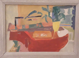
This pair of paintings were hung next to each other and I can see why. The shapes of the later abstract painting below, echo some of the forms and colours used in the earlier , more figurative painting of gardens above. Once you got your eye in , you could see he used the same motifs again and again in other works.
The layers of bleeding colours in this 'stripe ' painting ' Lux Eterna' are mesmerising , reminding me of Gerhard Richters 'Cage ' paintings with their hidden depths. Also the edges were interesting and then I found this statement of how important they were to him.
I attempted to draw the colours and composition of this piece ' Blue Painting Sept 1961" in my sketchbook. What drew me to it ( apart from it being like indigo!) was the very subtle variations in colour of blue with little tonal contrast ( except for the bright orange complimentary colour right on the edge of course!). The balance and tension are masterly. I've found before how difficult it is to get an accurate colour match for indigo when printing or on the computer. The picture above is my own photo which I've manipulated in photoshop as well as I can to get an accurate depiction of what attracted me . The pictures of the same piece of work found on the web (below) while probably more attractive as posters/postcards give a very different impression of the work
The piece 'Horizontal Painting with soft black squares 1959' ( above) was a favourite when I asked which piece we'd take home with us. Unfortunately under agreements of loan for the painting you couldn't take photos . Again, you can see big differences in the different versions found on the web
In general , it was worth the trip and there was a lot to admire, but while I liked it I didn't love it, it didn't set my heart racing like some of the work by Peter Lanyon or Terry Frost .
What was exciting was the children's workshop that was going on while we were there ( it was half term ) , building up pictures in coloured acetate that were then sealed in a laminator. I wanted to have a go but I would need to take a child with me !
These coloured paddles used to demonstrate colour mixing were fantastic, I wanted to take them home with me , I shall have to ask for some in my Xmas stocking! It was appropriate that the installation ' Dutch Light' with Chatham Dockyards seen on an earlier visit was still there.


No comments:
Post a Comment