Monday, 18 July 2011

Anyone going to Ecovision?


One of the reasons I joined Surface Design Association (SDA) , apart from their wonderful magazine, was the hope that someday I might get to one of their conferences in the US, their most recent being 'Confluence'. So I was interested to receive an invitation to a European SDA conference entitled 'Ecovision ' in Tilburg, Netherlands in October 2011. I'm very tempted,  but wondering whether anyone else was thinking of going?

Wednesday, 13 July 2011

The Grey Side of Life

.
It started with turning 50 and the increasing numbers of silver hairs - as I only get my hair cut  short 3 times a year, the 'Mallen Streaks' ( remember that? ) are more becoming  prominent. Then 12 x 12 chose grey as their current colourplay theme. I've gone through grey quilt phases myself - for the series of honesty pieces but also 'winter trees' , an enlarged version of my first ever journal quilt in January 2003

In Elizabeth Barton's masterclass at FoQ and more recently Quilt University class'working in series' the importance of tonal studies was emphasised - something I'm really bad at sticking to as my love of colour means I  jump right in.
The final straw was  mixing greys from tiny dollops of primaries in Jo Budd's workshop at CQ summer school - a surprisingly absorbing occupation
 For those that asked about the pigment dyes used - they're selectasine screenprinting inks available from George Weil.  I thought at first that the acrylics I have already would do the job but  I doubt I could achieve such wonderful monoprinted marks as these without the acrylic drying too fast. (See how easily I get distracted by colour!)

So it was  with a sense of inevitability then that  I signed up for Sketchbook Project 2012  with theme ' The Grey Side of Life'.  A marked contrast to my 2010 Sketchbook ( which has just been digitised)  where I swapped the horrid Moleskine paper for colourful Khadi!!

Sometimes things come together in a surprising way and the elements from workshops and classes that stick are not necessarily the most obvious. I'm off to fish my greys out of my stash ,which is not small!

PS I can now hear properly again having had the remains of an earplug hoovered out at ENT outpatients. A bit sore and sensitive to noise, it's foam earplugs from now on!   

Monday, 11 July 2011

Lunch break

 It's a while since I paid a visit to my favourite bench - less than 10 minutes from the lab and despite being close to 'climbers and creepers' it's very peaceful (apart from the parakeets) and always empty even on the busiest summer day. Today though I shared it with a rather doeful creature obviously missing its owner!

Needed a bit of peace and quiet as partially deaf at the moment due to a mouldable ear plug disintegrating and its amazing what a difference it makes to toleration of sound! Also a change of focus from peering down the microscope all morning. With a new A6 landscape sketchbook to start , I  drew what was in front of me but using the negative shapes. Tricky! Perhaps I'll come back tomorrow and see if my new friend is still around .

Tuesday, 5 July 2011

Microcosm to Macrocosm

 A stimulating if exhausting weekend with Jo Budd at Contemporary Quilt Summer School at Belstead House.  We were working with a new medium to me- intensely coloured pigment dyes.
 After a scrummy dinner and a couple of glasses of wine we started applying binders ( 2 opaques and transparent SF20 ) in varying dilutions to our fabric- white on white in the fading light !
 In the morning we started with colour - choosing 3 primaries and attempting to mix some nice greys. I can do it with watercolours when I'm used to the pigments but  it took a while to achieve it with these dyes as they were so intense . Sludgy greens and purples ( well there's  a surprise) were the nearest  until I got Jo to bring out a bluer red .
 Then we 'coloured - in ' our white- on -white from the night before with the neutrals produced - the binders in their more concentrated form acting as a resist with some interesting effects on the back (these dyes bind to the outside of the fibres ) Watercolour effects and different types of monoprint were demonstrated and we spent the afternoon using these and our object of inspiration to produce lots of fabric samples ( which I was rather  regretting when it came to ironing them all to fix the pigment) I concentrated in monprinting with my wood-graining stamp and the zen of simple brush strokes - the advantage over acrylics being that they dried out slower and retained marks better.
 A change of pace and venue after another scrummy evening meal and a couple of glasses of wine - a show and tell of work we'd brought with us pegged to  a yew hedge. Coming by train like several others I'd just brought some journal quilts with me. An art critic cat strolled backwards and forwards - hope he was impressed!
Sunday was spent composing with our fabric - in my case outdoors propped against another yew hedge to get the most light and a bit of peace and quiet. While it's nice to chat while painting or over meals , it's a bit distracting when concentration is needed. The disadvantage was that we were the last to have Jo's valuable input but it did mean we had got quite a long way and she helped with some final suggestions that made all the difference
 The 'hand of the maker' is very evident in the marks I made on the fabric and I'll try to retain that quality. While I was waiting for Jo's advice on the red 'stick' piece I put together some of my favourite pieces in purple - mainly some hideous bits rescued with some last minute slapdash monoprinting to use up the dyes. Aren't those pieces often the best!!!
 I think I was partly inspired by the view of the roof line from my bedroom window.
Now I just need to write it up for the CQ newsletter!

Thursday, 30 June 2011

Packing for Summer School

Last day at work before Contemporary Quilt Summer School with Jo Budd on theme of 'Microcosm to Macrocosm. We were asked to bring an item with sufficient colour, texture and interest to work from . I instantly thought of the piece of wood I found on the Thames tow path on the way to work (and which my work colleagues were rather unimpressed with  when I came in brandishing my trophy). I've had to rethink my bag from the planned  small trundly suitcase  to large backpack  to accommodate it - see who I can demolish in the tube when turning round!
We'll be painting and dyeing so was  looking through my stash for white or plain  when I came across this wonderful piece of African damask batik which I shall sneek in my bag. I don't usually do much deying ( apart from Indigo ) although I like to use other peoples, especially when it  has the added benefit of supporting livelihoods.

Sunday, 19 June 2011

Some Colouring-In

 Apart from cooking, shopping and ironing , this weekend has been mainly spent Colouring-In having selected several potential ideas  for Brentford Boat series
 Some of the materials used - watercolours; neocolour crayons; grey pitt pens; inktense blocks and pencils. First time trying the inktense blocks (I love my pencils!) and I'm not hugely impressed - even with a gripper they're very crumbly, like conte. Nice colour range though - must add indigo and olive green to my neocolour collection.

 Started off with watercolour which was fun but decided really needed tonal studies. So printed out traced sketches onto thick copier paper  and tried some schemes out. Next step collage.

Saturday, 18 June 2011

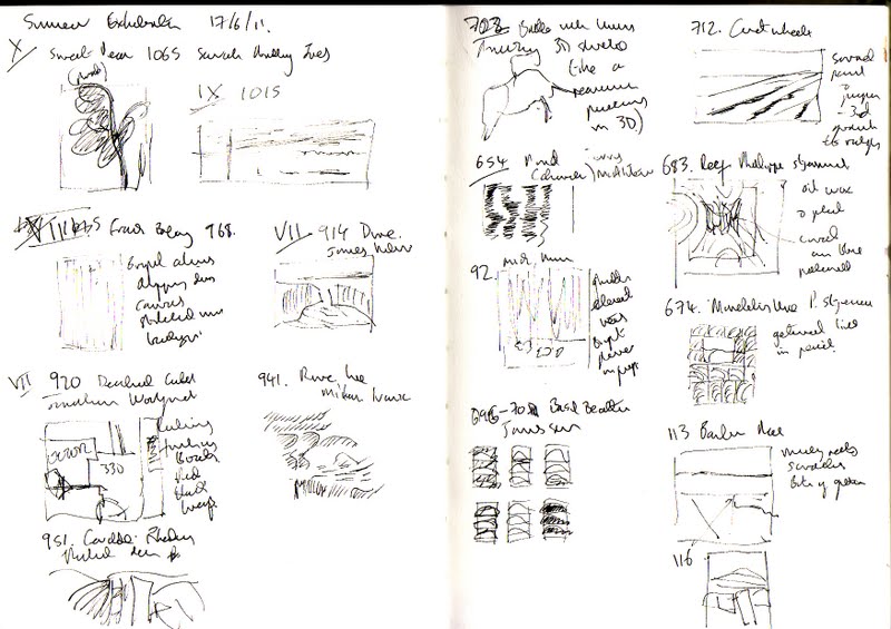
RA Summer Exhibition 2011

Inspired by the Culture Show special on the RA Summer Exhibition , we made our annual pilgrimage a bit earlier than usual. Entry was through the Central Hall and they'd  changed the rooms around from previous years ( more room for prints and drawings in I and II than the Large Weston Room) so didn't follow a logical order as in the past! A lot of people are rather sniffy about the Summer Exhibition (refering to it as a car boot sale among other derogatory terms) but I love it for its diversity. I  usually 'discover' new artists (at least to me ) and reaquaint myself with old favourites and this year was no exception

So let's do a tour!
First stop was the lecture room of Royal Academicians  curated by Michael Craig- Martin. I loved the Antony Gormly piece -it looks organic , like a swarm of bees for a distance but made of geometric forms and  Cornelia Parker's 'Endless Sugar' instalation of 30 squashed silver sugar bowls was subtle and mesmerising. You were so aware of the volume that had been sucked out of each piece and the subtle variation.

Next room 'IX' , has an embroidered piece 'Heartbeat' by Miranda Argyle - pleased to say much more prominent than her piece hidden away in the Small Weston Room in in 2009. It was 'Dagenham ' by Jock McFadyen that drew my eye- it looked at first glance  quite ordinary but with a dramatic sky and then you saw the detail of a thin line of house and buildings

In room VII, being on the lookout for boat paintings  'the deadliest catch' by Jonathan Wolfenden caught my eye as did the subtle drawings( almost like  a linocut) of 'River Lune' by Milan Ivanic.

I'm not sure  I agree with the curator of room V that  it is ‘only for people who are sensitive, intelligent and thoughtful. No one else will enjoy it: the works are delicate, subtle and rich.’ but it  was without doubt my favourite. From the sarcophagus of bones by Olu Shobowale to the gouaches of Ian McKeever, there was much to enjoy. The  sculpture by Cathy de Monchaux while uncomfortable was fantastic (in all its definitions) with its depiction of strange figures on unicorns like a renaissance painting in 3D. In the category of 'I wish I'd made that' was the painting 'Cartwheeler ' by Melanie Comber in oil and pigment  and 2 works by Philippa Stjernswald:  quiet , textured pieces in oil ,wax and mixed media.

By this time I was starting to flag (well there are over 1000 pieces in the exhibibition ), resisting the Pimm's,I  managed to have a quick skim of Room III , agreeing with the critics for once that the hanging did most of the work no favours. No time to absorb the prints , drawings and artists's books apart from the intricate folded paper cathedral window patchwork of antique books by  Francisco Prieto .
Just have to go back for a second visit