Investing in 2 Sew-Ezi tables was a good move , not only do I have dedicated set-up for both of my sewing machines but with a wooden insert and being able to position them anywhere in the room it makes boring tasks like stitching on hanging sleeves and labels so much more pleasant. I've spent many hours over the few days looking out the window and contemplating the early stages of my next few journal quilts.
Saturday, 10 June 2017
Monday, 5 June 2017
Saturday Life Drawing at at Creek Creative
I haven't done any life drawing for decades - it's one of those disciplines that I don't really enjoy but I know is very good for improving observational drawing and I've benefited a lot from in the past. When having lunch one day at the excellent Creek Creative , I noticed there was a tutored life class with watercolour with John Wiltshire on 3rd June . I try to avoid doing things on a Saturday to spend time with Ian but as he was working that day I had no excuse.
It turned out to be a really good session, I've spared your blushes including photos here , my studies were mixed in their quality so I'm just showing you the better bits!
The first challenge was setting up the easel - it's cunning design was not one I'd come across before but having tried it , I think it could be very useful to have at home.
We started off with some very quick poses using charcoal on newsprint, concentrating initially on fast and slow lines of the body. The model moved around 90 degrees each time - I rubbed out my drawing each time and drew over it, liking the history of the marks. We did this exercise twice, beginning to look for the negative shapes the second time round.
We then did a longer poise on cartridge paper applying what we'd learnt
After a well earned coffee we did 2 studies on coloured paper using charcoal/ graphite and white chalk looking at tone and areas of high contrast .I went a bit mad with the white chalk on my first attempt ( top) , my second (below) was an improvement.
We all shared a table at lunch ( excellent soup and cheese scone as usual!) and chatted with several very nice people, some having lived in the area a long time and already done several of John's classes , others like myself relatively new to the area.
In the afternoon we moved to watercolour using a limited palette ( I feel a visit to Cornelissens is required to buy some particular Schmincke colours - they were so intense! )
We were allowed to do a very light pencil drawing just to indicate the areas of contrast with quality of line and then built up layers of watercolour working from light to darks. The quicker painting I did on cartridge paper ( above) was better overall than the hour-long one I did on watercolour paper( below)as although I got some nice effects with hard and soft edges, I continued when I should have stopped!
It was a most enjoyable day , thanks to an excellent tutor, good company ( and lunch) and a fantastic model, without having to travel up to London. I'd definitely do further courses there, the Auerbach one looks intriguing.
Sunday, 4 June 2017
Ways into Abstract Painting Week 5 : Personal Project
The last session of 'Ways into Abstract Painting' was devoted to our own projects based on the techniques we'd been shown during the classes and researching examples at Tate Modern. It was a 2 easel day for me as I tried different ideas out!
As my main aim on coming on the course was to help me in my design work for textile pieces, I returned to the subject matter I'm using at the moment, breakwaters at Birchington on Sea .
In the advanced Painting class last year, in spare moments I produced a lot of layered, scumbled backgrounds and brought some of these along with me.
My first experiment was using the black dry brushstrokes of Pierre Soulages as inspiration . I loved how the background shows through but then went too far reintroducing some of the white - it was better left alone !
So to try out more ideas I used another of my scumbled backgrounds and a different format- a bit rushed so the paint didn't have time to dry between layers and I didn't achieve the clean lines I was after but bits of it are nice!
Shozo Shimomoto 'Holes' from back and front
At the end of the previous class , I'd prepared several layered ,painted surfaces with newspaper applied to cartridge paper then painted with white acrylic, thinking I would work on something based on Shozo Shimomoto's 'Holes' But with further research on his methods of layering multiple sheets of newspaper I decided I didn't have time in a day to do it justice.
The surfaces themselves had dried with very interesting textures - some people in the class 'stole' my idea and produced some great pieces of work! I look forward to using them myself at a later stage.
As my main aim on coming on the course was to help me in my design work for textile pieces, I returned to the subject matter I'm using at the moment, breakwaters at Birchington on Sea .
In the advanced Painting class last year, in spare moments I produced a lot of layered, scumbled backgrounds and brought some of these along with me.
My first experiment was using the black dry brushstrokes of Pierre Soulages as inspiration . I loved how the background shows through but then went too far reintroducing some of the white - it was better left alone !
I was keen to use a canvas as well as paper so the day before had painted over a failed painting with a grey-green. Tinted white paint added with credit card and drips and splashes in the foreground in preparation for the breakwater posts
The last half hour before lunch I had a very satisfying time mixing paint swatches to match the colours in Nicolas de Stael 'Marathon' ( I'd printed a photo of it and laminated it, excellent tip as inevitably paint gets on the photo!)
After lunch using some of the colours from de Stael but deciding against original plan of impasto techniques I added more drips and splashes and painted breakwaters in with dryish brush
I'd forgotten the pleasures of painting on canvas( I'd constructed this one myself with high quality fabric) such a different surface to paper. I was a bit more considered with marks and from across the room the tutor said 'stop' so I'm leaving it as it is for the moment! I might play around with options in Photoshop and work on it some more but slowly.
A very interesting review session in the final hour - peoples work was so varied with starting points from different aspects of the course and their own interests and experiences. Some had used oils rather than acrylics and that's something I want to explore further, the potential in layering colours and working more slowly.
Wednesday, 31 May 2017
Ways into abstract painting week 4: Tate Modern Visit
Last week we had an 'off site' visit to Tate Modern to research the work of a variety of artists , looking at the ways they use colour, composition, paint application etc. We were working in small groups , finding artists who used one of each of a range of painting techniques eg impasto, directional brushmarks and then discussed what their starting point was ( observational, memory, random ) and how treatment of the work affected the atmosphere or feeling of the piece) . Then individually we did sketches of composition looking at tone and colour study.
We started in ' In the Studio' and the group I was with looked at works by Duncan Grant and Matisse . I wouldn't necessarily have chosen this work myself but I like how it's obviously based on a room and easels etc but interesting composition and colour choices. Then the security guard suggested I deposit my rucksack in the cloakroom/lockers and on my return it was difficult to get back into discussions so contrary to instructions , I went and looked at work on my own.
It's probably just as well, I'm not very good at looking at artworks with others unless it's a tutor pointing out key features etc. When I go to exhibitions with friends or Ian , tend to go round separately
It was interesting to look at work with an initial focus on painting methods - picking up on the 'grissage' of Max Ernst and the outlines and subtle layers of Jean Miro. The intense blue initially looks flat but looking closer you can see directional brushmarks.
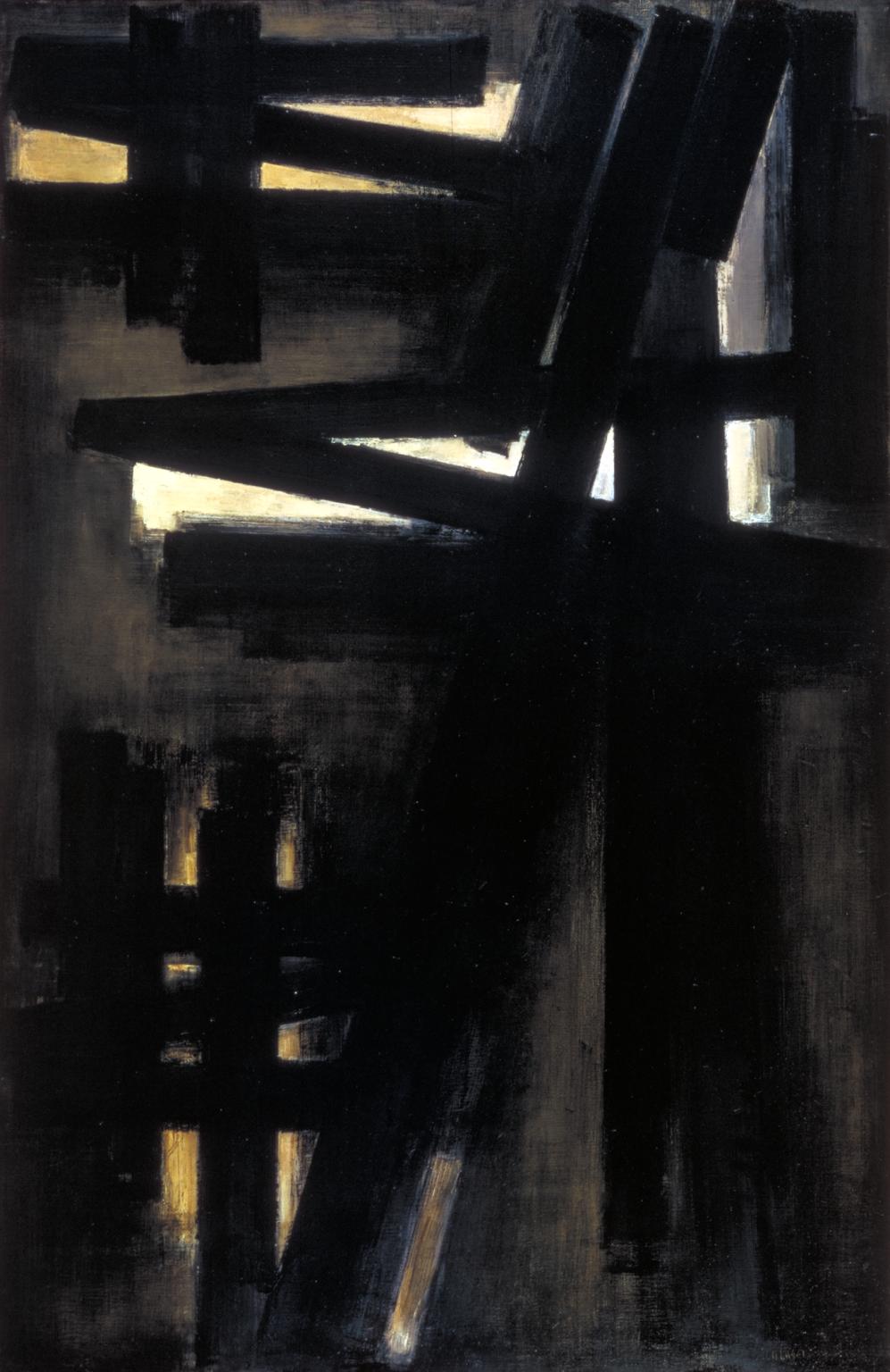
Nicolas de Stael was an obvious example of impasto! The notes on the wall/ website suggest that the title perhaps indicates the comparison with creating a painting and the extended exertion of a race.
However the composition to me looked like a head or helmet like the ones worn at the battle of Marathon ( Ian' s interests in military history obviously rubbing off on me....)
I was so wrapped up in analysing this artwork with its' combination of burlap, paint and a colour palette similar to the coastal ones I'm using at the moment that I lost control of my crayons . One rooled behind the security wire so I had to ask a security guard to retrieve it for me!
Nearby was this large work by Pierre Soulages, with its calligraphic heavy directional brushmarks.
I paid homage to Gerhard Richter and did a quick sketch of Winifred Nicholson's calm piece in ' Art and Society' I like her quote about abstraction:
"the nature of abstract colour is utter purity – but colours wish to fly, to merge, to change each other by their juxtapositions, to radiate, to shine, to withdraw deep within themselves."
By the time I'd looked once again at Shozo Shimamoto's ' Holes' I'd run out of steam so had a quick look around the Giacometti before meeting up with the class for coffee and to discuss our findings.
It was really interesting to see what others had discovered, some had concentrated on just one or 2 paintings, others had a different mix to my own selection. I'd missed the Kurt Schwitters and the Peter Doig so had a look at those before returning to City Lit. With browsing in the bookshop and getting sidetracked by Magdalena Abakanowicz I only had 10 minutes to eat my lunch!
In the afternoon we started on a project working from a similar starting point to the artist we'd chosen. Most people were looking at composition but my starting point was the process used by Shizo Shimamoto of layering newspapers . I was interested to read more about the Gutai group having coincidentally looked at work by 2 members.
I had a happy afternoon glueing pages and torn up bits of text and pictures from that day's Metro onto cartridge paper and then applying white paint using different methods ( credit card scraping, brushwork etc ) ready to tear up and layer the following week. . Reading more about his work and the process involved I realised that the delicacy of the orginal piece come from multiple layers of newspaper glued with flour and water contrasted with the use of enamel paint - I don't think what I've prepared will work in the same way.
I've also been thinking about why I wanted to do this class ( to help with abstract composition in my textile pieces) and how I could best use what I've learnt so far in a final project. Further work on holes and tears requires more attention to materials and process than can be achieved in a days' class so I'm putting that interesting topic to one side for the moment.
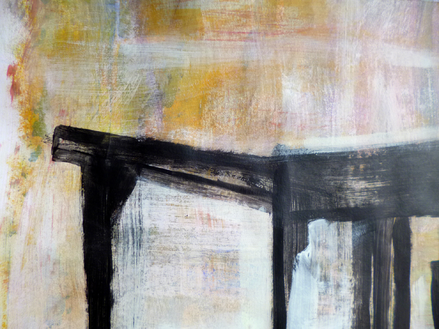
So for tomorrow I'm looking at the brushmarks/ impasto of De Stael and Soulages and have printed and laminated photos so I can do some colour mixing , (particularly of greys) in preparation for the next in my ' Birchington Breakwater ' series.
Monday, 22 May 2017
Ways into Abstract Painting Week 3: Random Systems and memory/text
Week 3 on 'ways into abstract painting' and we were looking at random systems. Jackson Pollock was the obvious example but also other abstract expressionists . Also favourites like the 'Cage paintings by Gerhard Richter ( which I look forward to revisiting this Thursday when we have a visit to Tate Modern
Our 'random systems' were rather more prosaic: throwing a dice for type of mark / paint application method ( eg drip, squeegee, dry brush , finger etc); drawing a card for position on paper ( eg bottom right, allover) and spinning a bottle for colour!
Some very interesting effects ,some due to paint not fully dry such as black squeegeed paint over yellow drips in the first painting at the top.
In my second go, I used some techniques and colours I hadn't used before so semi-random, but found it more difficult and less successful making decisions for myself!
We looked at some artworks where text had been employed as marks or the inspiration for artworks. Jasper Johns is the obvious one ( reminds me I still have to post about' the American Dream '.... )
Julie Mehretu
Jessica Rankin
Maliheh Afnan
Mira Schendal
Kurt Schwitters (incorporating text in collage)
The example used for painting a memory was the 'portraits' of Howard Hodgkin like the one above of David Hockney.
I'd brought the poem 'Breaths ' by sweet honey in the rocks which I'd used for my Cynefin piece 'Voice of the Waters' and memories of a particular place' Thorn's Gill'
I had a fine time mixing colours and using the written words themselves as marks , very different to my usual painting style but that's the point, to try something new. I should have stopped at the stage above ( I particularly like the right hand side with 'moaning rocks' in grey and ' crying grass' in yellowy -green) but as usual went too far ! I'm getting better at slowing down, spending more time looking than painting and making more considered marks but I'm not there yet.
Subscribe to:
Posts (Atom)


