Showing posts with label Birchington. Show all posts

Wednesday, 31 May 2017

Ways into abstract painting week 4: Tate Modern Visit

I've spent most of the last week stitching and painting my entry for SAQA 'Made in Europe II'   but  with that completed ( a day before the deadline!) I can concentrate on looking through my notes and sketches  in preparation for tomorrow's final session of 'Ways into Abstract Painting' . It's gone so quickly!
Last week we had an 'off site' visit to Tate Modern to research the work of a variety of artists , looking at the ways they use colour, composition, paint application etc.   We  were working in small groups , finding   artists who used one of each of a range of painting techniques  eg impasto, directional brushmarks and then discussed what their starting point was ( observational, memory, random ) and how treatment of the work affected the atmosphere or feeling of the piece) . Then individually  we did sketches of composition looking at tone and colour study.
We started in ' In the Studio' and the group I was with looked at works by Duncan Grant and Matisse . I wouldn't necessarily have chosen this work myself but  I  like how it's obviously based on a room and easels etc but interesting composition and colour choices.  Then the security guard suggested I deposit my rucksack in the cloakroom/lockers and on my return  it was difficult to get back into discussions so contrary to instructions , I went and looked at work on my own.
It's probably just as well, I'm not very good at looking at artworks with others unless it's a tutor pointing out key features etc. When I go to exhibitions with friends or Ian , tend to go round separately


It was interesting to look at work with an initial focus on painting methods - picking up on the 'grissage' of Max Ernst and the outlines and subtle layers of Jean Miro. The intense blue initially looks flat but looking closer you can see directional brushmarks.


Nicolas de Stael  was an obvious example of impasto! The notes on the wall/ website suggest that the title perhaps indicates the comparison with creating a painting and the extended exertion of a race. 
However the composition to me looked like a head  or helmet like the ones worn at the battle of Marathon  ( Ian' s interests in military history obviously rubbing off on me....)


I was so wrapped up in analysing this artwork with its' combination of burlap, paint  and a colour palette similar to the coastal ones I'm using at the moment that I lost control of my crayons . One rooled behind the security wire so I had to ask a security guard to retrieve  it for me!

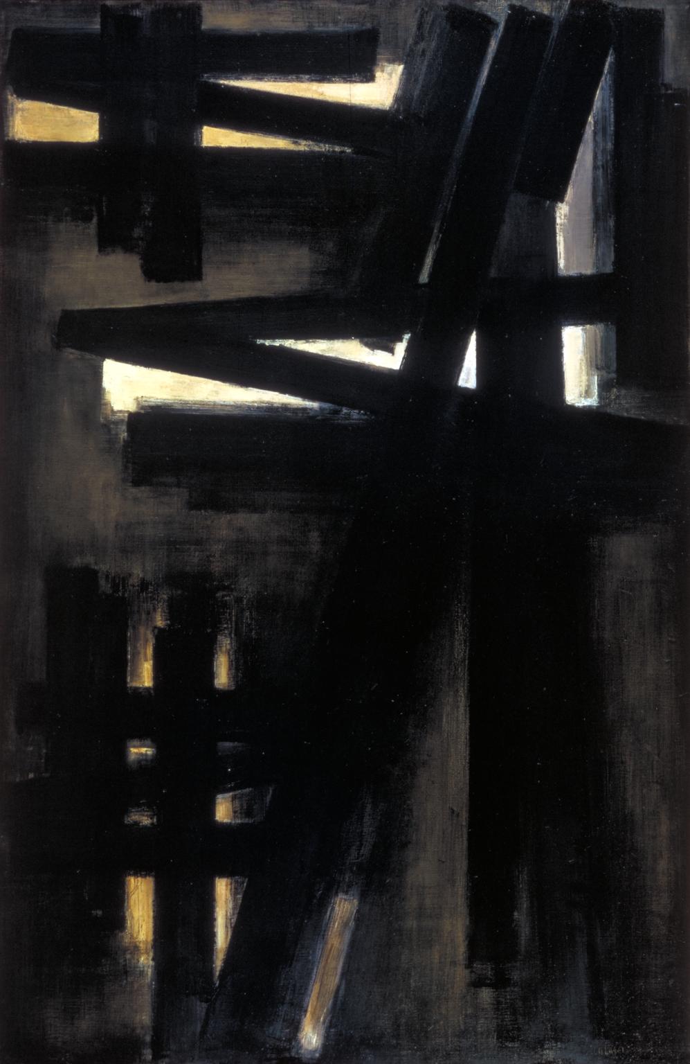
Nearby was this large work by Pierre Soulages,  with its calligraphic heavy directional brushmarks.

I paid homage to Gerhard Richter  and did a quick sketch of Winifred Nicholson's calm  piece in ' Art and Society'  I like her quote about abstraction:
"the nature of abstract colour is utter purity – but colours wish to fly, to merge, to change each other by their juxtapositions, to radiate, to shine, to withdraw deep within themselves."

By the time I'd looked once again at Shozo Shimamoto's ' Holes' I'd run out of steam so had a quick look around the Giacometti before meeting up with the class for coffee and to discuss our findings.
It was really interesting to see what others had discovered, some had concentrated on just one or 2 paintings,  others had  a different mix to my own selection. I'd missed the Kurt Schwitters and the Peter Doig  so had a look at those before returning to City Lit. With browsing in the bookshop and getting sidetracked by Magdalena Abakanowicz I only had  10 minutes to eat my lunch!


In the afternoon we started on a project working from a similar starting point to the artist we'd chosen.  Most people were looking at composition  but my starting point was the process used by Shizo Shimamoto of layering newspapers . I was interested to read more about the Gutai group  having coincidentally  looked at work by 2 members.

I  had a happy afternoon glueing  pages and torn up bits of text and pictures from that day's Metro onto cartridge paper and then applying white paint using different methods ( credit card scraping, brushwork etc )  ready to tear up and layer the following week. . Reading more about  his work  and the process involved  I realised that the  delicacy of the orginal piece come from multiple layers  of newspaper glued with flour and water  contrasted with the use of enamel paint - I don't think what I've prepared will work in the same way. 

I've also been thinking about  why I wanted to do this class ( to help with  abstract composition in my textile pieces) and how I could best use what I've learnt so far in a final project.   Further work on holes and tears requires  more attention to materials and process than can be achieved in a days' class so I'm putting that interesting topic to one side for the moment.   


So for tomorrow I'm looking at the brushmarks/ impasto of De Stael and Soulages  and have printed and laminated photos so I can do some colour mixing , (particularly of greys)   in preparation for the next in my ' Birchington Breakwater ' series.  


Thursday, 9 February 2017

Traces, Places


 January 2017
After a lot of cogitating,  ' Traces,Places' is the theme I've chosen for CQ Journal Challenge  2017 , hopefully broad enough to encompass  interpretations of  my surroundings in scraps and old quilts. I have big plans ! and  intend to use these as samplers   and try-outs for larger pieces , partly working towards  Cwilt Cymru's next exhibition ( the theme being 'traces')   but also  entries for  other  competitions and exhibitions as well as building up a series of work  based on the breakwaters and sea defenses at Birchington.  

Postcard textile  sketches
  It always takes me a while after I've been doing  an art course  and been bombarded with ideas and techniques to see what sticks, to see what I can take and use in my own work. There was  a lot of useful stuff covered in 'Advanced Painting'  particularly in strategies for starting; choice of colour   and 'steal like an artist ' looking at others work , pinching ideas and making it your own .
Paul Nash

John Piper
 One of the lessons was on using Photoshop or similar, not only at the start  but to look at your own work differently ( eg  reviewing tone, increasing saturation or contrast) and try different scenarios out.  As I've been thinking for a while of using the back of an old red and white log cabin ( I love the holey 'marks'!) ,I'd already been playing with images  using  the 'conte' filter .  The images above are manipulated artwork of Paul Nash and John Piper  while the image below is one of my photos of Birchington
.


And then manipulated  copies of my own work 'Bexhill Breakwaters'
 When CQ  Kent group came to visit ( there were 10 of us  packed in the lounge!) I gave a very quick demo of the acrylic  techniques I used ( summarised in a series of posts I did for 'And then we set it on fire... 'blog).  I'd forgotten  the delights of painting over old stitching samples ( below)  

So I'm currently  revising the methods I was using and working on some samples to  try painting on ( a lot of stitching from the back  of a gessoed section of quilt with Perle thread in the bobbin) . Watch this space!