Showing posts with label Advanced painting. Show all posts

Wednesday, 25 July 2018

Large Scale Sketchbook Week 8 and Conclusions.


It's nearly 4 weeks since the  final session of Large Scale Sketchbook  but with so much going on there hasn't been time to report  on it and record  my thoughts ( tho'  I made sure I wrote up  my notes  in my notebook straight away)  .  At the end of the session I brought my  the sketchbook home , which entailed a taxi from the station it was so heavy. Tomorrow, a couple of  artist friends are coming round to view it so I thought it was about time I wrote about it here!

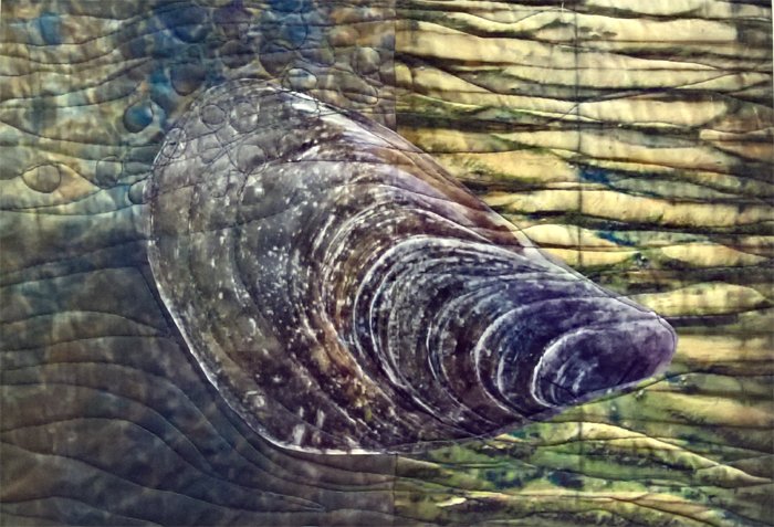
After Week  7, I'd run out of ideas  about what I wanted to do with work based on the cast courts , mainly  because the subject matter itself didn't inspire.  The night before the final session  I had a brainwave ( or so I thought....) The lines of stairs and curves of the sculpture in contrast to the surrounding architecture  reminded me of the work  I'd done on shells a ( mussels and limpets) in the advanced painting course in  2016. 
 At the time , I concentrated on developing the mussel paintings  set in context of surroundings ( influenced by the work of Paul Nash)  and hadn't done much with the limpets.  I'd been influenced   by the 'Circle' exhibition at Margate Turner Contemporary  , particularly the pile of black discs by Edmund de Waal,  and had drawn and photographed   a stack of limpets , delicately balanced  and carried out  work in Photoshop  combining it with prints of the Fleet  done during   a printmaking course

I gave Tony a whole lot of photos of my sketches/photos to photocopy to A3 size  and while I was waiting,  starting several pages  in,  I assembled a pile of limpets  and drew it large scale  using charcoal  ( which gave interesting marks on the previous page).  I then carried out a number of different approaches using photocopies; graphite and rubber; sanguine pen; coloured pencils;  and cutting out holes through several layers. 


 I was enjoying   applying what  I'd learnt  to new material but a lot  of what I produced wasn't really working.  Luckily at that point it was my turn to discuss my work with Tony.  He was a bit  surprised I'd discontinued with what I was doing in previous weeks when it had been going so well  while applauding the idea of using my own material to try out  what I'd learnt from earlier lessons ( "the Ideal Student" !) . 

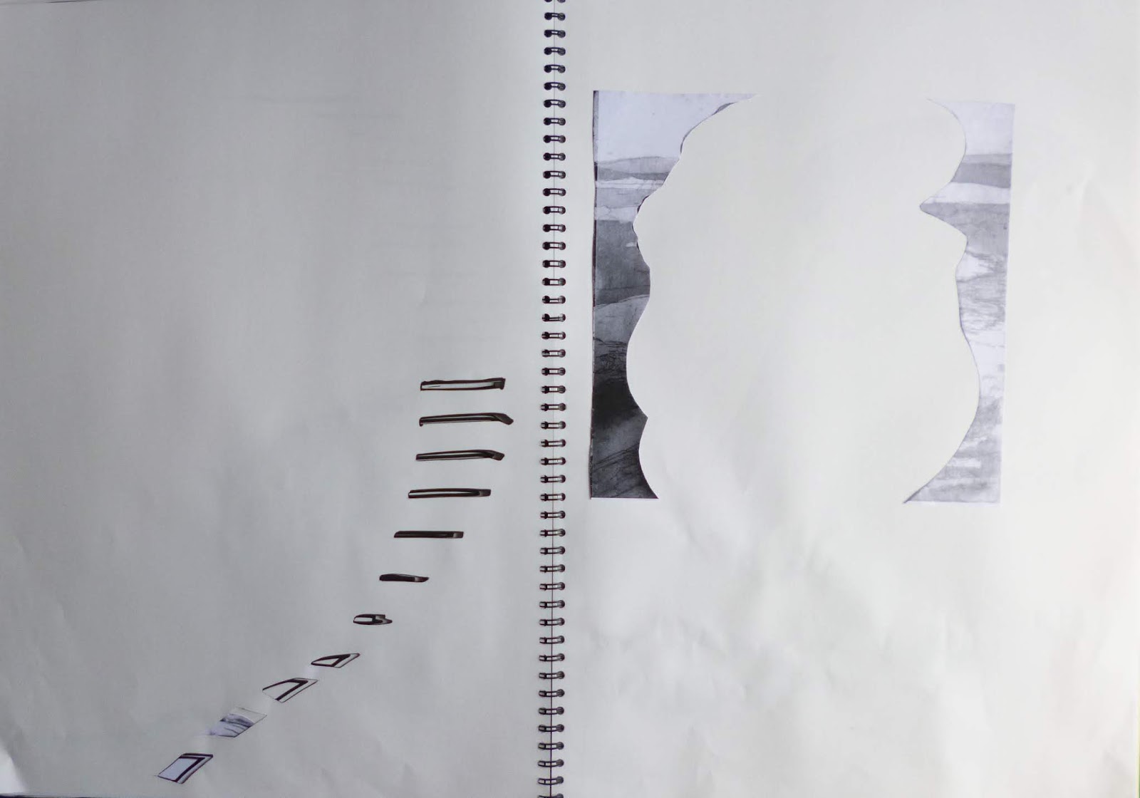
The main reason the shells weren't working  as well was because they were on the whole  central on the page and retaining identifiable structure of existing images  and therefore weren't so exciting.  The danger with using material we care about  is that you have to work harder as not so inclined to experiment  or try things out . 

Looking back  at the earlier weeks when we'd been working with still life  with random objects
 and to some extent the Cast Courts  where it wouldn't have been my first choice of subject , I was more prepared to experiment, fragment images, as I was  looking at the shapes and lines  rather than the subject matter.  Looking with  Tony at previous  pages ,  the most exciting  were when I'd left a lot of space , repeated ideas over several pages ( copies of copies of copies)  and made good use of the edge of pages rather than placing images centrally. 

He made suggestions on extending marks over drawings and copies  ( including  use of the negative shapes left when cutting out)   and putting objects at the edge of the page.  Also to be even more radical  with my cutting, removing items completely.  

 This was more like it ! 


My final intervention  was to go back to the last spread from the cast courts  and cut out the fine lines of the stairs , and extend the line with graphite.  With the negative shapes from around the limpet stack pasted  in , there  was now a link between the  two areas of subject matter.

We  cleared up early  in order to look at everyone' s sketchbook  briefly ( although it still took an extra hour - I missed my train and had to get a later one) . Well worth it though - they were so diverse in approach and content considering we'd all  begun with the same  subject material!
Didn't  make notes at the time but these stuck in my mind:
- finely folded/pleated  paper ( like tiny steps)
- transparent fabric inserts ( also tracing paper and acetate)
- exploded shapes reassembled, photocopies cut into strips and expanded
- images torn up and collaged back ( in some cases just a few tiny pieces)
- layers  of subtle colour  under cutouts
-  images wrapped around edge of page ( so just see a glimpse)
- foldouts
- extreme cutting ( a fine lace-like network).

 I also have a list  of what I like in my own sketchbook  and ideas for future work.
Finally,  as is usual on City Lit courses, there were suggestions about what courses we might want to do next ( printmaking from the images produced  was one).
In my case , I'd  enrolled and paid for Extended Drawing for Artists  and Makers (EDAM)  that morning.   So a year  of experimenting  lies ahead!  

Tuesday, 24 October 2017

Contemporary Painting Studio weeks 1 & 2

I'm getting back into my stride now on the second week of 'Contemporary Painting Studio' at City Lit with Lucinda Oestreicher, picking up where I left off on 'Ways into Abstract Painting' .  
The piece above  used one of the newspaper collaged backgrounds I'd prepared,  with brushstrokes  inspired by Pierre Soulages. Still a bit heavy handed  but I've some further backgrounds to play with  

The first week  was a bit difficult -  being the 'new girl' in an established group; new equipment (option of   a large screen  in addition to an easel); the ' where do I start' dilemma after a gap of several months. My main problem ( as usual!) was having too many ideas  and trying to do everything at once .
I'd initially decided when booking the class all those months ago ( it fills up very quickly) that I would use the opportunity to leave work there to develop my oil painting techniques   and that my subject matter would be boats, continuing  from 'Reading a Paint Surface'
So I started off with  developing compositions   based on  sketches and photos from Iron Wharf  ( we had another walk around there a couple of Sunday's ago , I must post some more photos, there's a new old boat!) 

But of course I'd also taken some of  my artwork based on breakwaters and  did some colour sketches of those too.  While I was waiting  my turn for some advice from Lucinda, I prepared some more scumbled backgrounds ( one of the many useful techniques from Advanced Painting course).

The  suggestions from Lucinda were to try out   many compositions in black and white only, working tonally initially and to take just one subject at a  time and explore it thoroughly.   Of course I knew that  but in my haste to get into colour  I'd forgotten the basics! There wasn't time to do many in the class but I bore it in mind for the next session  and was much better prepared. 

 Week 2 started with a look at everyone's work so far, to see different peoples  approaches to using reference materials , testing out ideas, getting started.  Some were using  collage , others painting on photocopies or cropping images , there was working directly from sketchbooks, blowing up images on the OHP projector, layering images and a couple starting painting directly and responding to what was happening on the surface, doing one piece and then working from that in a series of samples  not referring to the original source. Most were working from photos or sketches but a few were working  with more abstract concepts including family memories  and recent events in the news. 
I'd brought in  a  folder with the work I'd done in Photoshop  for ' Birchington Breakwaters' ( which I suppose was tonal being red and white rather than black and white)  along with  sketches  and photos of  my journal quilts and previous paintings. Lucinda referred to it as the 'archive' approach. In a later discussion  she said she could see how both my scientific  and textile backgrounds  came into play with my methodical  sampling of techniques.  


There were demonstrations of image transfer  using acrylic gloss gel  ( which I realised afterwards was the basis of paper lamination )  and of using the OHP to play with scale and orientation of images. I used this to combine  photos and drawings on acetate  projected onto a larger piece of paper.  Interesting use of obsolete equipment, years ago I used my slide projector  to project a slide of Moroccan sand dunes onto  my quilt top for ' Erg Chebbi',  I'm just as happy using tracing paper as it simplifies the image. 

With my reference material taped to my  wheeled screen I worked on  a scumbled background with  just black and white acrylic paint

At the end of the session, rather than throw the paint away, I used it up scraping  it on my paper 'dropsheet' with a credit card. Love the marks which suggest rocks and sea foam

I'm feeling more settled now  in continuing to explore the theme of breakwaters and the interaction between my painting and textile practice. On Friday  I'm heading  off  again to Studio 11 in Eastbourne for a mentoring session with Christine Chester.(I'm planning to do some monoprinting with my bench time )  Filling in the questionnaire   has already helped a lot in making decisions about what to concentrate on , in this case breakwaters and acrylics rather than boats and oil paints as is feeds in more directly into my textile work . 

Wednesday, 6 September 2017

Matisse in the Studio at the RA

 Matisse 'Rocaille Chair' 1936  

Making  the most of my   day in London after 'Drawing Tuesday' in Regent's Park, I'd booked 2.45 slot for 'Matisse in the Studio' at the Royal Academy . It had parallels  with the  glorious ' Matisse, his art and Textiles' exhibition held in the  same gallery in 2005 ( more than 10 years ago, it doesn't feel like that). I've spent this morning going through the book again, when I should I have been doing something else, reminding myself of the ' Haiti's' that are a feature of this exhibition too.


 The juxtaposition  of some of his favourite objects  with the paintings and sculptures  they inspired or   featured in  was fascinating ( I covet his green glass vase)  
I bought a copy of the ' Introduction to the exhibition for Teachers and Students'  which  explored  key pieces in  depth , asking  questions  that make you think such as ' What is the difference between a mask and a portrait? Using this  as  a guide and  using   exercises  from ' Advanced Painting '  and 'Ways into Abstract Painting' gallery visits, I  took notes and made quick sketches   which have given  me  food for thought , particularly in composition and paint application ( I'm thinking of returning to oils for 'Contemporary Painting Studio' course   at City lit ). Also reminded me how much I like drawing pewter!  
Matisse 'Large Red Interior' 1948
 It was good too to  be reminded of his  paintings of interiors.  I first  visited the   Centre  Pompidou in Paris in the late 1980's  on a work trip   stopping off between Rilland and Amiens. I was blown away by the artwork  particularly  'Florentine Villas'   by Paul Klee  and 'Large Red Interior ' by Matisse and bought large posters of both.   These  posters combined with  kelims bought on trips to Turkey and  Morroco  were what made various small  rooms in shared houses and   my first purchased   flats  ' home' . In my tiny studio  flat, the Matisse print gave the illusion of additional  rooms and enlarged the space. Alas  the poster  got water damaged   when in storage between moves  but  the kelims are still in use.  

Thursday, 9 February 2017

Traces, Places


 January 2017
After a lot of cogitating,  ' Traces,Places' is the theme I've chosen for CQ Journal Challenge  2017 , hopefully broad enough to encompass  interpretations of  my surroundings in scraps and old quilts. I have big plans ! and  intend to use these as samplers   and try-outs for larger pieces , partly working towards  Cwilt Cymru's next exhibition ( the theme being 'traces')   but also  entries for  other  competitions and exhibitions as well as building up a series of work  based on the breakwaters and sea defenses at Birchington.  

Postcard textile  sketches
  It always takes me a while after I've been doing  an art course  and been bombarded with ideas and techniques to see what sticks, to see what I can take and use in my own work. There was  a lot of useful stuff covered in 'Advanced Painting'  particularly in strategies for starting; choice of colour   and 'steal like an artist ' looking at others work , pinching ideas and making it your own .
Paul Nash

John Piper
 One of the lessons was on using Photoshop or similar, not only at the start  but to look at your own work differently ( eg  reviewing tone, increasing saturation or contrast) and try different scenarios out.  As I've been thinking for a while of using the back of an old red and white log cabin ( I love the holey 'marks'!) ,I'd already been playing with images  using  the 'conte' filter .  The images above are manipulated artwork of Paul Nash and John Piper  while the image below is one of my photos of Birchington
.


And then manipulated  copies of my own work 'Bexhill Breakwaters'
 When CQ  Kent group came to visit ( there were 10 of us  packed in the lounge!) I gave a very quick demo of the acrylic  techniques I used ( summarised in a series of posts I did for 'And then we set it on fire... 'blog).  I'd forgotten  the delights of painting over old stitching samples ( below)  

So I'm currently  revising the methods I was using and working on some samples to  try painting on ( a lot of stitching from the back  of a gessoed section of quilt with Perle thread in the bobbin) . Watch this space!


Tuesday, 31 January 2017

Tate Britain: Drawing Tuesday

  Last week's 'Drawing Tuesday' was at Tate Britain  where I followed the exercise we'd done there when I  visited with advanced painting group.  I concentrated mainly on work in the galleries  from  end of 19th beginning of 20th Century . Canadian  artist Elizabeth Forbes  was new to me -  what drew my eye was the interesting composition  and her treatment of  the subject matter ( we've a lot of marshes and channels in the 'land between' around here ) Although quite a gentle palette of colours, I liked the use of light outlining of dark and the brushmarks follow the contours

 Dora Carringtons' 'Farm at Watendlath'  is an old favourite , it really does capture the  Lake District , the lines of the walls and the monumental nature of the fells. It's basically a palette of greens and greys   but with strong contrasts of dark and light. The figures add a sense of mystery.


Whistlers ' Nocturne Blue and Silver  Chelsea'  was an interesting challenge in trying to analyse the colours  in such a subtle piece ( and also  a lesson in accuracy or not in reproduction) The top image is from the Tate website, the photo below what I took with my phone which show how much more varied and subtle the colours and tones were.  It  demonstrates  how important it is to see artworks in the flesh. The  bushstrokes were very evident - it looks like glazes over a darker ground  and the boat looked like paint had been removed . Lovely murkiness ! It reminded me how much I enjoyed the exhibition 'Turner, Whistler,Monet' and had me returning to the catalogue!  
 I only realised a bit later that all 3 examples I chose to examine had high horizon lines - obviously a subliminal preference of mine that I should take heed of .
After lunch in the  Djanogly café ( a bit peeved that  unlike  V&A and British Museum, you don't get a  discount in their restaurants  for being a member ) , I revisited the Paul Nash exhibition and  drew a few pieces of work, it really makes you  see what's going on.

Meanwhile,  I've finally finished painting the dining room , it looks so much lighter and  warmer (it's North facing and the coldest room in the house). I'm  pleased with my work, particularly that I haven't lost the knack with skirting boards. When I worked  in a  Youth Hostel  30+  years ago, we were closed for a month for repairs and repainting - I did miles of skirting in the dormitories, hard on the knees  with no carpet and no heating.


Monday, 28 November 2016

Advanced Painting: More Mussels and Transcription


 Before my Advanced Painting class on Friday  I prepared a couple of  quilted pieces  with photos of the outside and inside of a mussel shell  printed onto black t-shirt transfer paper applied to a  fabric background (monoprinted or  printed photos of shibori/sand ripples. My intent was to extend the patterns from within the shells to their surroundings, embedding them.  More work is required  but I'm excited by the possibilities. Next step scaling up! There was a lot of interest from the others in  my class on using  textiles  to paint on.

 I also did some more work on the  canvas  from a couple of weeks ago, building up more layers , again more work required.
 The focus of the lesson  itself  after a pep talk on strategies for working was on 'transcription ' copying artwork and making it your own  , looking at the techniques used but also as  a springborad for your own ideas


  We looked first at Kehinde Wiley's interpretation of David's Napoleon  then discussed how to 'steal like an artist'   like Picasso did!
  A bit of fun looking at the  pastiches of Edward Hopper's ' Nighthawks' ( original at the top) . It's actually quite difficult to find a picture of the original if you google it, there are so many parodies!  But  you could  use a detail, the colour scheme , the composition  and  produce  something completely different.

Eileen Cooper  spent some time as artist-in residence at Dulwich Picture Gallery  and   you can see some of the influences of looking at the paintings there in her  work but it is uniquely hers


  The  optional exercise was to  copy Titian's Bacchus and Ariadne  looking carefully at composition  and tone. I didn't do it myself as I was absorbed by the  mussels  but there were some very varied and interesting results from those that did  from random colour choices ( but observing tones) to broad expressive bush strokes.  It reminded me how much I  learnt drawing from the masters at the National Gallery, so much I did it twice!  And   just rediscovered from the books in storage is this book which features some of my drawings.