Showing posts with label still life. Show all posts

Thursday, 15 November 2018

EDAM Week 6 : Drawing Space and Light (3)

  In the  3rd and final session with Anne Teahan  on drawing  space and light   we were putting together  what we'd learnt  in the previous 2 classes in 1 large sustained drawing.   

 As a bit of homework  I'd done a quick trial   comparing  the usual   City Lit  heavyweight cartridge paper ( which is actually very good, it comes  from R K Burt ) with some Clairfontaine watercolour paper . I was wanting something with a bit more 'tooth ' to  hold the  charcoal  and liked the effect of the back  of the watercolour paper ( channeling my inner Seurat!)   But I found  a whole A1 sheet  was too stiff to roll up  for the class  so City Lit cartridge it was. 
The  easels  were already set up around a selection  of still life objects ( to which we contributed some items - spot my pewter pot!) , lit from 1 side to cast strong shadows. 
 The aim was to  build up a background  of space   with depth made up of many  ghostly layers of charcoal   marks  ( or with chalk fingerpints on black paper ) and then integrate  the objects and shadows. I'd liked how the organic lines had worked in the first week's drawing  ( above)  so wanted to do something similar . 


I got rather obsessed with my charcoaly hands and fingers last week  so decided to work again from my 'inky digit' photo,    drawing lines, rubbing them out,  until I had about 10  layers of marks.  Great fun!     


 I struggled  however with the drawing of the objects and shadows. When Anne came to  talk to me ,  she pointed out how static  and safe my observational drawing was  in comparison to the energy of the background  and suggested  I return to the drawings I'd done in the first week  based on Antony Gormley's 'Feeling Material' (below) 

 Much more satisfactory, using the overlapping spirals to describe the form, matching the marks in the background  and actually more of a 3D quality 

Then the  shadows changed with light pouring in from a window  and the paper just wouldn't take any more charcoal  and my  eraser was making no impression  introducing lights. Time to call a halt. 
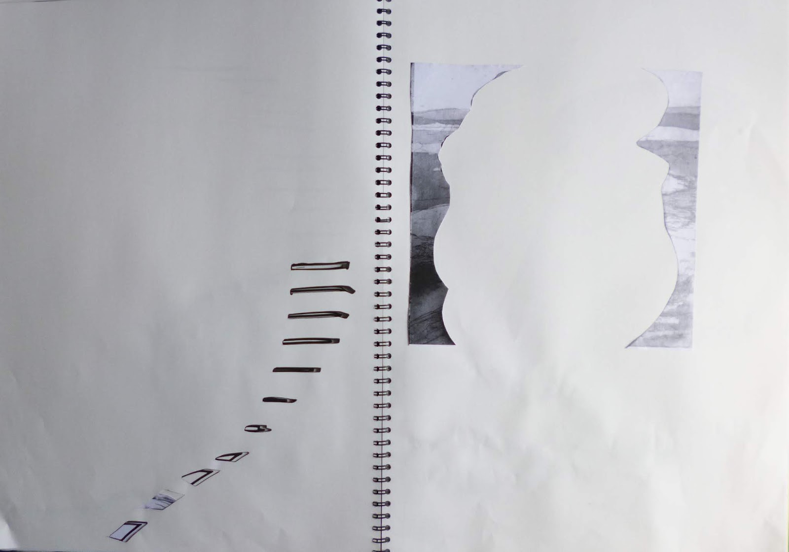
 When we running out of steam , we looked through some slides of Ben Nicolson   works ( similar to those  below)   to get some ideas of how to integrate  backgrounds and objects  to create a cohesive whole. Some way to go in that regard! 


 At the end of the session when Anne looked  at my final piece  she said she'd hesitated whether to tell me to consider changing the way I was drawing  but I'm so glad she did!  It must  be difficult  for tutors who don't know the students that well  to gauge  whether a student is open to  taking on board criticism.  
 Sub-consciously, observational drawing  for me is  bound up with botanical/scientific  drawing as part of my job,  doing it  accurately , 'properly'.  Recognising the energy, liveliness   in my  process of 'just' mark -making, I feel like Anne has given me permission to apply that  to observational drawing too. I was a scientist but now I'm an artist. 


Wednesday, 25 July 2018

Large Scale Sketchbook Week 8 and Conclusions.


It's nearly 4 weeks since the  final session of Large Scale Sketchbook  but with so much going on there hasn't been time to report  on it and record  my thoughts ( tho'  I made sure I wrote up  my notes  in my notebook straight away)  .  At the end of the session I brought my  the sketchbook home , which entailed a taxi from the station it was so heavy. Tomorrow, a couple of  artist friends are coming round to view it so I thought it was about time I wrote about it here!

After Week  7, I'd run out of ideas  about what I wanted to do with work based on the cast courts , mainly  because the subject matter itself didn't inspire.  The night before the final session  I had a brainwave ( or so I thought....) The lines of stairs and curves of the sculpture in contrast to the surrounding architecture  reminded me of the work  I'd done on shells a ( mussels and limpets) in the advanced painting course in  2016. 
 At the time , I concentrated on developing the mussel paintings  set in context of surroundings ( influenced by the work of Paul Nash)  and hadn't done much with the limpets.  I'd been influenced   by the 'Circle' exhibition at Margate Turner Contemporary  , particularly the pile of black discs by Edmund de Waal,  and had drawn and photographed   a stack of limpets , delicately balanced  and carried out  work in Photoshop  combining it with prints of the Fleet  done during   a printmaking course

I gave Tony a whole lot of photos of my sketches/photos to photocopy to A3 size  and while I was waiting,  starting several pages  in,  I assembled a pile of limpets  and drew it large scale  using charcoal  ( which gave interesting marks on the previous page).  I then carried out a number of different approaches using photocopies; graphite and rubber; sanguine pen; coloured pencils;  and cutting out holes through several layers. 


 I was enjoying   applying what  I'd learnt  to new material but a lot  of what I produced wasn't really working.  Luckily at that point it was my turn to discuss my work with Tony.  He was a bit  surprised I'd discontinued with what I was doing in previous weeks when it had been going so well  while applauding the idea of using my own material to try out  what I'd learnt from earlier lessons ( "the Ideal Student" !) . 

The main reason the shells weren't working  as well was because they were on the whole  central on the page and retaining identifiable structure of existing images  and therefore weren't so exciting.  The danger with using material we care about  is that you have to work harder as not so inclined to experiment  or try things out . 

Looking back  at the earlier weeks when we'd been working with still life  with random objects
 and to some extent the Cast Courts  where it wouldn't have been my first choice of subject , I was more prepared to experiment, fragment images, as I was  looking at the shapes and lines  rather than the subject matter.  Looking with  Tony at previous  pages ,  the most exciting  were when I'd left a lot of space , repeated ideas over several pages ( copies of copies of copies)  and made good use of the edge of pages rather than placing images centrally. 

He made suggestions on extending marks over drawings and copies  ( including  use of the negative shapes left when cutting out)   and putting objects at the edge of the page.  Also to be even more radical  with my cutting, removing items completely.  

 This was more like it ! 


My final intervention  was to go back to the last spread from the cast courts  and cut out the fine lines of the stairs , and extend the line with graphite.  With the negative shapes from around the limpet stack pasted  in , there  was now a link between the  two areas of subject matter.

We  cleared up early  in order to look at everyone' s sketchbook  briefly ( although it still took an extra hour - I missed my train and had to get a later one) . Well worth it though - they were so diverse in approach and content considering we'd all  begun with the same  subject material!
Didn't  make notes at the time but these stuck in my mind:
- finely folded/pleated  paper ( like tiny steps)
- transparent fabric inserts ( also tracing paper and acetate)
- exploded shapes reassembled, photocopies cut into strips and expanded
- images torn up and collaged back ( in some cases just a few tiny pieces)
- layers  of subtle colour  under cutouts
-  images wrapped around edge of page ( so just see a glimpse)
- foldouts
- extreme cutting ( a fine lace-like network).

 I also have a list  of what I like in my own sketchbook  and ideas for future work.
Finally,  as is usual on City Lit courses, there were suggestions about what courses we might want to do next ( printmaking from the images produced  was one).
In my case , I'd  enrolled and paid for Extended Drawing for Artists  and Makers (EDAM)  that morning.   So a year  of experimenting  lies ahead!  

Wednesday, 30 May 2018

Large Scale Sketchbook: Week 2


 Week 2 of 'Large Scale Sketchbook' started with the usual miscellaneous collection of still life objects, but rather than charcoal we were using pencil, encouraged to think about how we held it and the marks made 

 It's very difficult to get an accurate drawing  when you're working on such a large scale , particularly as we were seated around the table and unable to step back and assess. Still the ghostly marks left from many erasures adds to the surface.
 As in the previous week we added weak ink washes on the  darkest areas . We were then asked to choose our favourite 2 areas and these were photocopied .


Then in the last half hour or so the fun began - combining the photocopies  with the original drawings, cutting out, mixing up, creating repeats of patterns with different qualities. 

 As  I'd chosen 2  areas on the same page to photocopy, my copies were all quite similar  so some drastic cutting through of pages was required to create some interest and contrast.


 But then I rather liked the sense of space that  resulted, it's  easy to  build up more and more textures and marks, removing and taking away is just as important.

Saturday, 12 May 2018

Large Scale Sketchbook: week 1


Yesterday was the first session of ' Large Scale Sketchbook'  with Tony Hull  at City Lit . I got a lot out of ' Reading the Paint Surface' I did with him a couple of years ago and the Contemporary Drawing Sketchbook course  with Amanda Knight  so it seemed the logical next step particularly as 'scaling up' is something I want to tackle. 
From experiences of others who'd done the course before I was expecting an A3 softback sketchbook  but the course should really be called  Very Large Scale Sketchbook  as we were given a  Seawhite A2 wire-o hardback

 We were all seated around a big table ( with extra tables added to extend it when we opened our sketchbooks)  which was a lovely way of starting. After  introductions , a still life was set up  in the centre of the table of some of the usual random selection of objects: bottles, tools, a teapot, a  large metal 'P' (above); a creepy looking doll.  Starting several pages into our sketchbooks we then  drew with charcoal  over a double page  A1 spread ( bit tricky with the wire in the middle). Lots of rubbings out which  gives a lot of lovely ghostly marks then  measuring, trying to make it a more accurate drawing.   
We then made up a very light ink wash and painted all the darkest areas with it, letting it dry during a teabreak  while we filled in the  admin forms. 

On our return we turned our sketchbooks upside down so more aware of shapes rather than objects  and started  cutting into the pages with a  Stanley knife

Initially the shapes cut out were glued  to the page beneath so that superficially the upper page still looked the same but then we became braver and stuck pieces on different places/pages. 
Every so often we  walked round the table to see what other people were doing - considering it was the same materials and objects being drawn , the approaches used were very different and  inspired by others  we started  cutting right through the pages, creating flaps  and holes. 


Finally we did a tour around the table again , opening and closing folds , revealing different combinations , before putting them away in a drawer until next week ( they're definately not very portable...)


So many possibilities  and ways of looking in just 3 hours! We have another session of exploration  next week  before the site visit to V&A Cast Courts in week 3. Unfortunately I'll be away for that  so will have to make a visit  under my own steam. My current sketchbooks ( A5 and A4) suddenly seem very small.

Tuesday, 11 October 2016

Start Oil Painting - Glazes, Scumbling, Impasto

The second of my beginners oil painting class  built on the underlayers we'd  prepared the previous week - oils need time to try.
In the morning on the primed board we  first applied glazes of  Alizarin diluted with  thinner and linseed oil mixture - the idea being that the underpainting shows through . Then glazes of grey   and yellow ochre- at last the kiwi fruit started to take shape
Then adding highlights using a pale pink ( a little white goes a long way and lots of mixing involved from starting point of Barbie pink!)
These were left to dry  and similar process of glazes added to red and green sketch on paper.  First glazes of alizarin and yellow ochre, also some cadmium red with a teeny bit of white to make it opaque rather than transparent.


The addition of bright greens and then greys made a dramatic difference - I really liked how the complimentary colours  make the apples 'pop'.
Then after lunch   with glazes partially dry we 'scumbled' dry paint into the glazes ,built up layers with small brushstrokes of concentrated colour, and scratched out areas with palette knife. I loved how the brush marks from my imperfect priming of the board show through. And look how good my palette control was ! It helped that I'd brought lots of my own palette knives and brushes with me - you really need a separate brush for each colour as you don't clean them until the end of the session
I was really pleased with the results considering it was just 2 session, I tried to use different techniques for each piece of fruit, some more interesting than others. I look forward to applying them in my 'advanced painting ' course which starts soon.
Considering we were all working from the same subject with the same materials there was a wide variety of paintings produced.  From across the room  Julia captured my concentration in her charming study ( even my earrings!)