Autumn fungi, wildlife, fruits and leaves: Train Journeys; expeditions; Matthew Harris course at Lund Studios; Mexican pine leaf basket; Anthony Gormley inspiration.
Showing posts with label Antony Gormley. Show all posts
Showing posts with label Antony Gormley. Show all posts
Thursday, 31 October 2019
Thursday, 15 November 2018
EDAM Week 6 : Drawing Space and Light (3)
In the 3rd and final session with Anne Teahan on drawing space and light we were putting together what we'd learnt in the previous 2 classes in 1 large sustained drawing.
As a bit of homework I'd done a quick trial comparing the usual City Lit heavyweight cartridge paper ( which is actually very good, it comes from R K Burt ) with some Clairfontaine watercolour paper . I was wanting something with a bit more 'tooth ' to hold the charcoal and liked the effect of the back of the watercolour paper ( channeling my inner Seurat!) But I found a whole A1 sheet was too stiff to roll up for the class so City Lit cartridge it was.
The easels were already set up around a selection of still life objects ( to which we contributed some items - spot my pewter pot!) , lit from 1 side to cast strong shadows.
The aim was to build up a background of space with depth made up of many ghostly layers of charcoal marks ( or with chalk fingerpints on black paper ) and then integrate the objects and shadows. I'd liked how the organic lines had worked in the first week's drawing ( above) so wanted to do something similar .
I struggled however with the drawing of the objects and shadows. When Anne came to talk to me , she pointed out how static and safe my observational drawing was in comparison to the energy of the background and suggested I return to the drawings I'd done in the first week based on Antony Gormley's 'Feeling Material' (below)
Much more satisfactory, using the overlapping spirals to describe the form, matching the marks in the background and actually more of a 3D quality
Then the shadows changed with light pouring in from a window and the paper just wouldn't take any more charcoal and my eraser was making no impression introducing lights. Time to call a halt.
When we running out of steam , we looked through some slides of Ben Nicolson works ( similar to those below) to get some ideas of how to integrate backgrounds and objects to create a cohesive whole. Some way to go in that regard!
At the end of the session when Anne looked at my final piece she said she'd hesitated whether to tell me to consider changing the way I was drawing but I'm so glad she did! It must be difficult for tutors who don't know the students that well to gauge whether a student is open to taking on board criticism.
Sub-consciously, observational drawing for me is bound up with botanical/scientific drawing as part of my job, doing it accurately , 'properly'. Recognising the energy, liveliness in my process of 'just' mark -making, I feel like Anne has given me permission to apply that to observational drawing too. I was a scientist but now I'm an artist.
Thursday, 8 November 2018
EDAM Week 5: Drawing Space and Light (2)
Week 5 of Extended Drawing for Artists and Makers started with a recap of the previous week where we'd been drawing space, through transparency. Anne had brought in one of her fragile artworks to show us, made from strips of paper , asking us to compare it with the very solid brown teapot it was based on. This week we were looking at surfaces and the way light bends around the surface and the awareness of the sense of touch
 |
| Anne Teahan |
 |
| Antony Gormley |
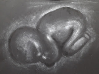
We looked at 2 different art works by Antony Gormley based on the human form with very different scales and approaches: ' Exposure' ( above ), a huge structure composed of space and the small dense, dark, form of 'Iron Baby' cast from his daughter ( exhibited as part of 'Found' at the Foundling Museum)
 |
| Antony Gormley |
Thinking of how you might draw this sculpture, we looked at the drawings of Georges Seurat with their rich blacks of Conte on textured paper built up of tone rather than line, his approach to curved surfaces. (I rediscovered my 'World of Art' book on Seurat bought in 1980 when I got home - I've always preferred his drawings to his paintings)
 |
| Georges Seurat |
 |
| Georges Seurat |
 |
| Georges Seurat |
In these portraits by Chuck Close, he's used clusters of fingerprints to create tone - using different pressures to create light and shade, using touch itself .
 |
Chuck Close
|
 |
| Chuck Close |
So our drawing tasks for the morning were to draw from photo of 'Iron Baby' with white chalk on black paper and charcoal on white paper working directly with our fingers and hands , feeling our way around the subject , working lightly to begin with.
We set up a 'palette' on the corner of the paper, rubbing the white chalk to create a dense covering which we lifted off with fingers to draw/ smear on the paper, replenishing when needed, creating a tonal scale with white fingerprints down the edge. Working outwards ,we used an eraser to remove some of the chalk marks, to define shapes and lines ( trying to avoid using the chalk directly until working on the strongest highlights)
Introducing the dense , velvety blacks of compressed charcoal was left to the end , using the same technique of rubbing on the corner of the paper for a palette and then applying fingerstrokes in the very darkest parts of form
We then repeated the process in reverse, using willow charcoal initially before the compressed charcoal. The results were much better ( and more interesting) with white on black than black on white , partly because the subject was dark so didn't need as much of the chalk to find and define the form ( neither of the papers had much a 'tooth' to hold the pigment.), partly as I was looking intently just at the areas of reflected light rather than the subject matter. It was quite magical gradually seeing the 'ghost' emerge, the trick was to put a bit more definition in certain areas - the fist, the line along the back
Having said I don't really like charcoal to draw with as it's messy and dries out my skin, I rather went for it, with a bit of encouragement using the side of my hand to draw with ! I rather like the smudged overlapping lines and marks that you couldn't get any other way.
I couldn't resist taking 'selfies' of my hand ( but then I have used my 'inky digit'
I then found the work of Judith Ann Braun!
 |
 |
| Judith Ann Braun |
In the afternoon we applied some of the techniques to the shiny black vessels or objects we'd brought in ( in my case a coffee filter cone) , starting with charcoal on white paper
 |
| 'Spaceship Caffeine' |
I didn't have much time for doing the white on black version ( especially after all the hand washing to remove at least some of the charcoal) - a bit more accurate, a lot less lively.
Next week we're doing one A1 drawing based on the combination of space ( transparency) and light( surfaces, touch). Lots to think about!
Subscribe to:
Posts (Atom)


