Showing posts with label monotype. Show all posts

Friday, 9 March 2018

Contemporary Collage Week 7 : 'Pop Collage' ( and transfer techniques)

I missed last weeks class on 'Assemblage'  as I was in Rydal but  had sort of incorporated elements of that in my box constructions of the  week before. This week we were told to bring in an  A3 photograph  to cut up and recompose as a suitable under painting  and a song lyric or title. I spent Sunday afternoon on my return looking for suitable images and choosing  a song ( ' The Tide is High ( and I'm holding on' ) by Debbie Harry, one of the 80's soundtrack I pedal to on the excercise bike) ! I toyed with ' Startrekking' ....  In the end I needn't have bothered , what was needed was  any collage suitable for taking further using drawing, paint and transfer techniques . I had my ' Scrap' book with me  so Simon  photocopied pages from this up to A3 size 


 I took tracings of the outlines of this 'Greek God'  collection  then did another tracing of the shapes 
The First technique I tried was using carbon paper under the tracing and then applying inks to the resulting drawing 
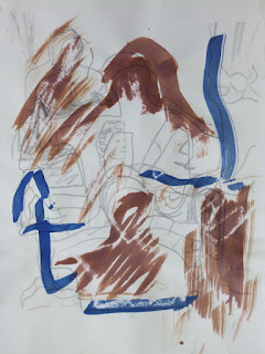
Mixed results with monoprinting : we inked up acetate sheets and placed paper and  then tracing or photocopy on top and drew through the layers. Too many variable of paper ( wet , damp or dry) , pressure , how much ink on the acetate , these ( above, below and top ) are the least worst. 

I had better success  with the tracings of faces then monoprint.( carbon paper also worked well for this)  

While I was waiting for my  scrap book and photocopies, I put together a quick   A3 collage of circles and curves to use 
 I used this as a basis for colour monoprinting: placing image under acetate sheet, colouring areas with coloured printing ink and transferring acetate to dampened piece of paper. 
I've had much better results using monoprinting before  both  as a drawing medium and using acrylic/ seletescine inks  on fabric . However I like the idea of using a collage as a starting point for painting  and might explore using different colour  carbon papers 


Meanwhile collage materials are taking over my studio! As a newbie to this technique, how do people store and organise all their bits? 


Saturday, 7 January 2012

Button Journal Quilts


I've been making journal quilts for 9 years now so I was determined to finish  the last set for CQ challenge but  had to grit my teeth. I normally  use  journal quilts as testing grounds for larger pieces - with themes set this year that was rather more difficult and the earlier sets of 'circles' and 'text' were in the end stand alone with little  connection to my other work. I knew I would struggle with 'buttons' as  I couldn't help thinking of  Elizabeth Bartons' comments  on  embellishments - how so many people spend 3 minutes using their first idea, 3 months making it and then as it doesn't work, put beads on it!  

As I've been going through a phase  of curved piecing African and indigo fabrics , I used some of the scraps left over in the first JQ adding some mother of pearl buttons that also went in the indigo vat. I've been wanting to try curved piecing some other African kola and indigo fabrics  to suggest sand ripples so that was my second . I do feel that these pieces would work just as well or better without the buttons!
Then I remembered how I'd successfully conquered another embellishment  (pearls) earlier in the year and used a similar aproach for  the third and fourth examples. I scanned some mother of pearl buttons - some small ones and a few  very large ones that reflected light  and after a bit of manipulation in Photoshop , printed them on  indigo cotton, indigo silk and silk organza. I combined these with an altered photo of a shoreline and a fabric copy of one of my 'ghost' monoprints from city lit which used threads.
Much happier with these and in a  way they sum up  my creative year: seascapes  transparency, printing, indigo. 
Much happier too with this years Journal Quilt Challenge which has just been announced - a return to A4 and the theme of 'shades of... ' starting with red which is what I'm working with at the moment anyway. Hurrah!!

Tuesday, 25 October 2011

Sand Ghosts and Threads


Print 1: Dirty yellow ink applied with brayer to mylar sheet ( same one  as used for 'Green Sea' prints - halved  trips to the press!) Rayon standed thread applied to plate. On the print the white areas left are embossed (or should that be debossed?) 
Print 2: 'Ghost' print with threads removed - you get a dark outline around where the threads were.
Print 3: Another 'ghost print , this time with the threads added back after being on a green sea print - I love the subtle colours it adds in this detail (below)


Print 4 : Additional ink added then lines scored with end of paintbrush. If you look very carefully, there's still the very faint outlines of the threads beneath .

I got a lot out of this workshop - not least seeing what everyone else got up to. There's no way I'm going to use oil-based inks at home so I'll be interested to see how these techniques will work with acrylics or selectasine screenprinting inks  on fabric ( succumbed after all - George Weil is such a temptation!). Any idea where I can buy mylar sheets?It was a joy using the press - doing it by hand gave mixed results.  Might have to sign up for the class again in February...

Green Sea Ghosts and Threads

Print 1: Ink up mylar sheet with murky green, place sections of builders scrim, put through press. Decided not to continue with the scrim as pattern a bit regular but others were very grateful for my supplies and used them to great effect.
Print 2: Apply another layer of murky green ink and rayon thread already used on a yellow print. Use rag dipped in Zest-it to remove areas of ink. In the 'crit' at the end this was everyone's favourite of my work - wonderful subtle textures and colours.
Print 2 detail: Colours deposited by the threads being on the yellow print.
Print 3: 'Ghost' print of print 2
Print 3 detail: loving the textures here.

Print4: More ink applied and  moved around with brushes and rags dipped in Zest-it .

Working into Light

This Sunday at City Lit, only half the class turned up for the second session on monotypes (perhaps because the weather was so nice?) Their loss- we had more access to the presses! I came prepared with all kinds of ideas  but in the end spent most of the time exploring what the materials would do, inspired by  the same photos and sketches I used last  week of the sea, this time in colour!! My wrist certainly knows about the work needed with a 'push knife' to get the printing inks into a workable state.  The larger expensive rollers were in use so I  used the poor quality of the smaller brayers to my advantage - I rather like the blotchiness of the ink. Just scoring into the surface with the end of a paintbrush produced intriguing results
The bristles of the paint brushes gave interesting marks and once I'd got going with laying some standed rayon threads down there was no stopping me!


The 'ghost' prints were especially appealing. More on ghosts and thread in further posts.  

Monday, 19 October 2009

Monotypes

Last week was manic, working very long hours for Kew's 250th Anniversary Scientific Conference. Exhilarating though, and we've had very positive feedback. I debated on Thursday night whether I would go to my drawing class as I was exhausted but so glad I did - we were doing monotypes ( just like Tracey Emin!) Well perhaps not the subject matter. Drawing the large cheeseplant resident in the classroom reminded me of doing so at A' level. Are they obligatory for school art I wonder?
Although I've done monoprints ( paint or ink on glass or plastic, laying leaves or making patterns then laying paper or fabric on top), this was a different process and one that excites me.

First of all we inked up a perspex sheet then carefully laid a piece of cartridge paper on top of it. Used a pencil to draw on the sheet of paper and then peeled back to reveal the print where I'd drawn. The magic was the smudginess of where my hand had touched the paper, transferring some of the ink
The plate meanwhile had white lines where the ink had been removed

Repeating the process using the same perpex sheet and adding another drawing (pencil above) gave ghostly white outlines as well as the transferred black ones in the resulting print below

The monotype at the top is the combination of these 3 drawings - I love the liveliness and complexity. I don't know how well this method would work with fabric but there's one way to find out....

I couldn't resist bringing home the waste sheet of paper on which we'd inked up our perspex sheets!
Critics comment on the childish writing in Tracey Emins' drawings but as many of these are monotypes I'm wondering whether they are a result of having to do it in reverse?